|
|
|
Showing 261 - 270 of ~1679 |
| Image |
Comment |
| 01/09/2010 11:21:58 PM | Swanby davidwComment: Love the great diagonal composition. Normally I don't like the wings to be so close to the edge, but it works on this one. Were you hand holding at 1/200 500mm on this? If so you did a great job with the camera shake. It is a little blurry, but not enough to ruin the photo. I'm also amazed at the great exposure control on the white bird with light background, I know how tough that can be. |  Photographer found comment helpful. Photographer found comment helpful. |
| 01/09/2010 11:17:50 PM | Week 1 (Horseshoe Falls)by ScapeshotsComment: Wow, what an awesome place! You have captured in wonderfully. I love all that ice in the foreground and the shutter speed makes the water look like ice as well. Great control of the full afternoon sun. | | Photographer found comment helpful. |
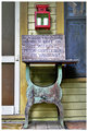
| 01/09/2010 11:15:11 PM | No Warningby L1Comment: Great shot Laurie! As you know I grew up in Fannin County in North Texas (2 counties north of Kaufman Co.) so I'm greatly looking forward to all your photos. I love the colors of this and the message is so typical of rural Texas! | | Photographer found comment helpful. |
| 01/09/2010 11:06:47 PM | 1 - Aloneby odriewComment: Awesome shot! Love the birds in the tree! I really like the light on those picnic tables, very interesting. As everyone else has said the mood is great in this. | | Photographer found comment helpful. |
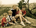
| 01/08/2010 01:31:11 PM | Visit to Gellibrand Hillby vladoComment: As a father of 6 I'm very much looking forward to your PAW! It is a great idea and perhaps one that I will do at some point. I really like the composition of this, they diagonal alignment of their heads really creates great rythm in the photo. Put me down on the side that doesn't care to much for the tones. I don't mind their clothes tinted like this, but the skin tones match to closely with their surroundings so my eyes don't settle on their faces which should IMHO be the focus of this portrait. Their wonderfully natural expressions almost overcome that, but I just think it would have had that extra "punch" with more contrast on their faces. Message edited by author 2010-01-08 13:32:16. | | Photographer found comment helpful. |
| 01/08/2010 01:21:09 PM | DSC_9003.jpgby Covert_OddityComment: I LOVE this image, the composition is so dynamic and the tones are wonderful. I love the glowing buildings with their super high contrast lines and words. Very nice! | | Photographer found comment helpful. |
| 01/02/2010 07:23:31 PM | Gold diggerby sarampoComment: Greetings from the Critique Club
This is an interesting macro puzzle, and I think you accomplished that part of the challenge quite nicely. There were several people who guessed it correctly, but only a few that knew for sure what it was.
I love the colors that you got out of the dvd and reflections of your counter top. The blue highlights on the cork screw don’t quite work though in the overall composition, they look more like accidental flares rather than supporting elements.
A few things that I think brought your score down are:
1. The horizontal cork screw does not have much dynamics. I think it would have worked better with either a diagonal or straight on with the end of the corkscrew falling out of focus. Overall it is out of balance.
2. The blue light streak from the DVD is really nice, but with just the one it seems out of place and distracts from the composition.
3. The spots (dust?) at the bottom need to be cleaned up.
4. The focus point is not on the most interesting aspect of the corkscrew. It seems to be on the cork in the last bend. I think this composition would have been a lot better with the point in complete focus. The DOF with macro is so shallow (even at f/16) you really have to have a point of interest for the eyes to focus on (unless it is an abstract) in my humble opinion.
5. There is not much separation between the background and corkscrew. I’m wondering if you could have positioned the flash behind the corkscrew, dialed down the flash output, and with the camera on a tripod shot with a slow shutter speed capturing the ambient light with balanced background light. You could have used a bounce card for fill maybe.
6. The flash seems to be pretty harsh judging by the highlights; did you cover the flash head with something to diffuse it? I like to make little soft boxes out of Kleenex or other boxes with cloth on the front of the box to create softer lighting. Bouncing the flash would also have helped.
This was a fun challenge and I hope you are not to disappointed in your score. There are a lot of wonderful macro shooters here at dpc and the bar is just so high. You photo is a good one and you should be proud of it. I also liked your Rubik’s cube and shower head shots. I think the shower head is my favorite.
| | Photographer found comment helpful. |
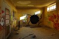
| 12/31/2009 11:49:48 PM | The Holeby GiorgioBaruffiComment: Greetings from the Critique Club
I was assigned this photo last week, but am new to the critique club and didn’t realize there was a time limit once a photo was assigned. I wrote a critique but it was too late so I’ll go ahead and just post it here anyway.
I am glad that I was assigned this photo: I gave it an 8 during voting but didn’t make a comment. This fascinating story is captured wonderfully with the natural light. I love the “fruit of the loom” looking creature that has created “The Hole” and it sends my mind off in many different directions…What happened to the poor fruit, what is it trying to tell us, just what has taken place here, why is that packman looking light pattern chasing it???? Well, that was my first thoughts on the photo anyway and now on to some of the technical aspects.
I love the color scheme in this photo, the red and green ink as well as the orange cast walls and light blues creates great contrast (complementary colors which are across from each other on the color wheel will do that). I also like the overall balance. There is just enough graphics on the left side to balance the right and the symmetry is great. Your correction of the lens distortion is great. The overall tonal range is wonderful as well.
I think a boost in the overall value or lightness of the scene would have made this score better (possibly). If it were me and since this was advanced editing I would have used a more aggressive curves adjustment (taking “The Hole” down some and bringing the highlights up). I would have then masked that layer and selectively dodged and burned with it to give it "pop". There is an overall "dullness" to the tones that in my humble opinion kept this one below 6.
I personally like your edit and is why my vote was higher than average, but I’m just saying what I think was lacking for the "normal" voters.
| | Photographer found comment helpful. |
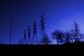
| 12/20/2009 09:10:20 PM | Tethered Titansby picklenoseComment: Greetings from the Critique Club
Let me start off by saying that I really like the deeply saturated blues and I think you accomplished your goal in post processing very well. I know with a subject like "powerlines" it is difficult to tell a story, so I think a successful approach to this challenge would be to go "graphic". In other words, forget about a story and concentrate on the beautiful shapes and lines, even to the point of abstractness. Your photo seems to be a "tweener", or part graphic abstract and part story telling. I suppose in certain situations that could be a good thing, but I think it hurt your photo in this case. The story just wasn’t bold enough to grab the attention of voters.
If I were entering this photo, I would have gone to the graphic side preferring a tight crop on the 6 power "poles". That would have created a very strong diagonal and diminishing line with no clutter (good for quick voters). The right side of the photo takes away from the overall balance of the image because of the trees and out of place power pole. The brighter area on the right steals all the attention away from the wonderful shapes and patterns of the 6 poles. I would have also not left so much black on the bottom. I would have left some, but not as much. Take your hand and cover the right 1/3rd of the photo and see if you like it more.
As far as processing and exposure go, I think you did an excellent job. The photo is plenty sharp with all lines being visible and no halos from over sharpening. There is a "crispness" to the photo that is excellent. My only recommendation here would be to watch the banding in the sky. The transition of blues is not as smooth as it could be, perhaps because of what you did to adjust the colors and saturation.
On the story telling side, think about these 3 elements of your story: Main subject, Supporting Elements, and background. For this challenge, the story being told is "Tethered Titans", the main subject is the actual power lines and Titans, the supporting elements are the trees, tall sign post, ground, and small posts and other items. The background is the beautiful blue sky. I think all of the elements of this story are competing with each other rather than being in harmony to support the main subject.
I really enjoyed critiquing your photo and spending some time getting to know it. I have touched on some things that might have helped it score better, but a good score isn’t always what the photographer wants. Thanks for allowing me to post my thoughts.
Jason Price
| | Photographer found comment helpful. |
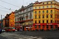
| 12/20/2009 02:21:52 PM | Keeping Prague Movingby GeorgeComment: Greetings from the Critique Club
Let me start out with what I like about this photo (and is what the other comments have already stated). The colors really take this shot from a lower 5 to a higher 5. The color scheme is "complimentary" which simply means the colors in the photo are across from each other on the color wheel. That makes the contrast really high between the orange building, blue-grey building and blue sky. The other element that makes this photo exciting is all the great repeating patterns. The foreground white lines on the cross walk, the windows and crosses in the windows, and the building itself.
Unfortunately the very elements that make this photo great probably bring the votes down for the challenge. I like to break the story of a photo down to 3 elements, Main subject, Supporting Elements, and Background. In your photo the building is the main subject. The power lines, street, bus, cars, signs, and people are the supporting elements, and the blue sky is the background. I think it is the fact that the power lines are only supporting elements (in my humble opinion) that kept this from being in the 6 range.
As far as the technical aspect, I don't see anything that would majorly affect your score. There are halos around the power lines from sharpening, but it would be very hard to avoid that in this situation. Another thing to consider would be opening up the aperture. I'm not familiar with the 18-55 lens you used, but most zoom lenses are not as sharp stopped down. You could safely hand hold down to 1/60th at 55mm on that lens and get a couple of extra stops on your aperture. I know on my 18-55 canon lens it is much sharper between f8 and f11. If it were me I would also go up to ISO 400 or even 800 to get that particular lens up to its "sweet spot". I am not suggesting that you needed more DOF, only that the technicals of the lens would have been better. I don’t mind the darkness of the photo at all and don’t think the voters did either. The great contrast and the good range in tonal values tells the voter that you had good control over the exposure.
To sum up, I like this photo and do not consider it too dark or boring in any way. 5.6181 is a good score here at DPC and the only thing it needed to be higher would be to make the power lines more prominent as Wolf stated in his comment. Of course that would completely change the photo and would then be a different story all-together, but would meet the challenge more!
| | Photographer found comment helpful. |
|
Showing 261 - 270 of ~1679 |
Home -
Challenges -
Community -
League -
Photos -
Cameras -
Lenses -
Learn -
Help -
Terms of Use -
Privacy -
Top ^
DPChallenge, and website content and design, Copyright © 2001-2026 Challenging Technologies, LLC.
All digital photo copyrights belong to the photographers and may not be used without permission.
Current Server Time: 06/22/2026 07:29:33 AM EDT.
|