| Image |
Comment |
| 01/25/2010 09:09:06 PM |
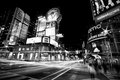
Dundas Lightsby rob_smithComment: I really like this composition and the tones are so amazing! The blurred humans are also a really nice touch. Great street capture. |
 Photographer found comment helpful. Photographer found comment helpful. |
| 01/25/2010 08:40:41 PM |
The Beauty of Death by skarpi_xxxComment: This is really quite an amazing juxtiposition of beauty and death, very well executed and totally strange. I like it! |
| Photographer found comment helpful. |
| 01/25/2010 08:38:46 PM |
|
| Photographer found comment helpful. |
| 01/25/2010 08:37:46 PM |
|
| Photographer found comment helpful. |
| 01/25/2010 08:35:52 PM |
|
| Photographer found comment helpful. |
| 01/24/2010 10:04:48 PM |
Taste for Tequilaby PelleComment: Greetings from the Critique Club
I love the tones of this shot and the lighting is wonderful. I also like what you've done with the processing, especially the vignetting. In a different challenge I think this had potential to score higher. I don't think many people "got" the humor in a child drunk behind the bar :) Also, as Moose408 mentioned the horizon is tilted slightly and doesn't help the composition. Speaking of the composition I really like the arrangement that you have created. I love the triangular composition created with the bottles and bar and the girl in the center works well.
The colors in this are really nice as well, the browns are just wonderful. Overall sharpness is also very good.
I think with the photo straightened and more of the girl in view (and in a different challenge) this would have been a high scoring photo. |
| 01/24/2010 09:45:50 PM |
A Visitby rooumComment: Greetings from the critique club
Congratulations on the successful execution of your signature style. It must be very satisfying to get your second best score with this shot!
I'm not surprised at all at the high score for this shot even though it is "artsy" and "abstract". The composition is wonderfully "clean" with all elements working together to create your vision. The wonderful lines, textures and desaturated colors support the subject so wonderfully. I love the contrast of the dark window around the bird and the frame. I've only done a few critiques so far and it has been fairly easy to come up with pointers on how to improve a shot until this one..I can honestly not think of a single thing that would make it better. It is no wonder that you have already gotten 13 favorites for this shot. |
| Photographer found comment helpful. |
| 01/24/2010 09:34:07 PM |
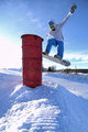
barrel tap to 180 outby chrispComment: Greetings from the Critique Club
Congratulations on a new personal best! This is a great action shot and I'm surprised it didn't break the 6.0 barrier. The composition is really nice and the colors are wonderful. I love the texture in the snow and the sharpness is great.
There were a couple of things that gave voters "easy outs" for voting low..I think for some reason voters look for those things and vote down even if they don't impact the photo. The first 1 is the blown sky left of the barrel. Vlado mentioned that it is a distraction and I think a lot of other people probably voted down for the same reason. To me the dark barrel steels more of the attention from the jumper (thus could be considered a distraction) than the sky. Because of the tonal value and warm color of the barrel it becomes the subject.
One thing that could have made this more dramatic is a lower viewpoint. Overall I like this composition and the processing and congrats again on the great score and new personal best. |
| 01/23/2010 10:43:19 PM |
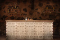
My worldby Rino63Comment: Greetings from the Critique Club
My first impression of this photo is very good. I’m a sucker for fisheye photos to start with, but the composition and colors are very nice as well. I love the “cool” color scheme and the touches of warmth in the city skyline and foreground. You have great framing on the bottom and top to keep the focus on the boat.
A couple of things that might have brought the score down is the overall balance seems to be heavy on the left (and perhaps a little unlevel, and there is some strange yellow green tint just to the right of the city at the horizon. A 5.788 is a very good score here at DPC, but typically to score higher, you need clean and simple compositions and there may just be too much going on in this photo for the quick voters. You have to keep it very simple for DPC voters. I see that you cloned out garbage and that really helped, I’m talking more about the boats on the edge of the scene. I like the composition as is and would not change it, but I’m just saying what helps photos score better here.
I think you could have gone a little more aggressive on the sharpening also. It seems to be a tad soft especially in the foreground. Perhaps f/16 and 1/80 shutter would have increased overall sharpness as well, although I’m not familiar with your lens and f/8 may very well be its sweet spot. One last thing on the processing I think a little more drama could have helped it by using a curves adjustment and applying a classic s-curve to the tones. That would create some great drama in the sky and brighten up the whites. I would love to see this in b/w as well and would help hide the off yellow in the sky.
Overall I really like this photo, I think a tilt to the left to help balance it, a little more USM and an s-curve tonal adjustment would have put this well over 6.
|
| Photographer found comment helpful. |
| 01/22/2010 02:07:43 PM |
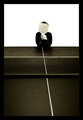
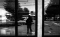
Self Styledby posthumousComment: Greetings from the Critique Club
My first reaction to seeing this photo is love of the great b/w tones. I am a big fan of well processed b/w photos no matter what the subject and this one is certainly well done. The curves adjustment and usm are perfectly applied for my taste.
I also love the bold shapes that you have included in your composition, but before I delve into those let me first talk about the story.
With photos that I critique I like to start by breaking down the story of the photo into its parts. Your main subject is yourself and your style (physically and photographically). You have created good separation between your main subject (you) and the supporting elements. The boldness of the wide black and white window frame on the right side does distract somewhat, but I like the shape so it is a nice element for my taste. When I view this portrait I do not see "clutter" (with the exception of the very bright window on the left) because the tonal value of your main subject, the placement in the center, and the framing help define it. The supporting elements of this portrait help tell the story of "you" and are also well used. I enjoy looking at all the "stuff" on the window ledge, the houses in the background, and the snow drifts. All of these items are in harmony with the subject and do not overpower it.
Now as far as the shapes that support the composition, I really love the overall “verticleness” of the composition with the bold window panes, your stance, and the trees in the background. The lines across the top and dark window ledge at the bottom provide anchors to keep you focused on the subject. Again the boldness of the right pane does attempt to steal the show here, but not successfully. I mentioned that the bright window on the left is “clutter” and what I mean is that it upsets the balance somewhat and is the only thing that tonally is not in harmony with the story. I think an 800x600 crop keeping your form in the center would cut out enough of that light to be more balanced.
I must say it has been a pleasure doing a critique where I didn’t have to worry about giving pointers as to how to score better! I really enjoyed getting deeper into your photo and "soaking" it up.
|
| Photographer found comment helpful. |
Home -
Challenges -
Community -
League -
Photos -
Cameras -
Lenses -
Learn -
Help -
Terms of Use -
Privacy -
Top ^
DPChallenge, and website content and design, Copyright © 2001-2026 Challenging Technologies, LLC.
All digital photo copyrights belong to the photographers and may not be used without permission.
Current Server Time: 06/22/2026 02:51:59 AM EDT.