| Image |
Comment |
| 06/01/2007 01:07:27 PM |
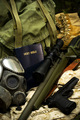
The Things I Carriedby EfergohComment: This is a very interesting composition! First on the technicals you have done a great job. The lighting is very natural and soft. My only nitpick is that the main subject for me is the Bible, but it seems to be just a tad oof (very small tad!).
As for as the religious message goes, I think this has been one of the strongest yet (I haven't seen them all yet though). I don't think many people will "get" the fact that as Christians we sometimes have to battle those that opress God's people and seek to destroy that which is good...so I'm guessing your score is suffering a bit. 10 |
 Photographer found comment helpful. Photographer found comment helpful. |
| 06/01/2007 11:40:19 AM |
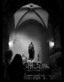
faithby sevilduvarciComment: I wished I could place my finger on why this composition isn't working for me..I think it may be because the lighter tones aren't closer to white. Maybe if the white ceiling was dodged to almost white...On the shadow side of things it is really nice (which is why I'm wondering why this photo isn't more powerful for me). Maybe a white border would have helped also? Anyway, I'm sorry to give you a 6 for this and not higher. Maybe it is the people in the foreground that isn't working....sorry I can't put my finger on it. |
| Photographer found comment helpful. |
| 06/01/2007 11:29:49 AM |
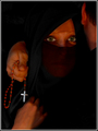
Devout Reverenceby LaMasComment: The overall softness doesn't really work for me on this and I think it is because of the color noise on her forehead and under the vail. Those areas look "splotchy" compared to the rest of the photo. I also think it would have been better with only one person as it is hard to tell how they are being reverent. I think if you could have reduced the noise in the areas mentioned above and selectively shapened the cross and her eyes I would have voted much higher. As is I think it is a solid photo deserving of a 7 for the mood and tone are wonderful. |
| Photographer found comment helpful. |
| 06/01/2007 11:25:18 AM |
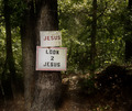
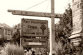
Path to Righteousnessby abrantonComment: I like your play on words here with the title and a literal path in the woods. I think the composition is a little boring though (sorry and that is just one persons opinion!). Perhaps if the signs would have been more off centered and the cameral was looking down the path it would have been better. I love the lighting and your post processing is nice. 6 |
| Photographer found comment helpful. |
| 06/01/2007 11:23:07 AM |
Paying Homage to the Car Godsby Pipe_DreamComment: That is a very strange religion. As a Christain I like the parallel with Christ's passion. The car (humans) has been set free from sin (the prison in the background). Processing is great so the colors are nice. That blown license plate sure is distracting though. 7 |
| Photographer found comment helpful. |
| 06/01/2007 11:18:41 AM |
Time Honored Traditionsby BMComment: Some times a blown out sky really creates a strong composition, but in this case I just don't think it works well. It is so overpowering of your main subject. I like the somewhat centered composition and inclusion of the stone monument (or corner of the church or whatever) on the right side. I also like your choice of saturation....matches the 1871 church very well. 6 |
| Photographer found comment helpful. |
| 06/01/2007 11:15:59 AM |
Begging Monkby tamatamaComment: I'm not so sure the use of pseudo HDR was a good choice here. For some reason it just doesn't seem to "work" for me. I admit thought that I prefer these type photos in b/w. With that being said it is a nice photo and does tell a story. I'm surprised you could get so much dynamic range out of one shot. Oh and I think it was very wise to not use a frame as the trees and stone provide that naturally...well done. 7 |
| Photographer found comment helpful. |
| 06/01/2007 11:13:04 AM |
The satoriby drynComment: I love the subtle highlight around the cross but I wished it was cropped tighter. I think if you could have cropped out the trees on either side and the white blob down low it would have been more powerful. The highlight around the cross really draws the eyes in though to that really makes this shot nice. 8 |
| Photographer found comment helpful. |
| 06/01/2007 11:10:46 AM |
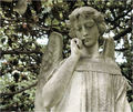
The Freckled Angel by CamComment: I like the filtered lighting on the Freckled Angel which has great modeling, but the background is so distracting. The blown out higlights and limbs going everywere make it hard for the eyes to stay planted on the subject....I like your choice of saturation level very much as the muted tones work great. A shallower DOF (smaller f number) would have blurred the background and provided a little more separation for the Angel. You probably already know that and were limited by equipment but I thought I say it anyway. |
| Photographer found comment helpful. |
| 06/01/2007 11:07:02 AM |
The Crossby SheryllComment: Very interesting use of motion blur, but I fail to see the reason for it. I'm sure that is just my lack of vision. The treatment seems contridictory to the Cross. As pure art I like it and it certainly is an interesting photo to look at. 6 |
| Photographer found comment helpful. |
Home -
Challenges -
Community -
League -
Photos -
Cameras -
Lenses -
Learn -
Help -
Terms of Use -
Privacy -
Top ^
DPChallenge, and website content and design, Copyright © 2001-2026 Challenging Technologies, LLC.
All digital photo copyrights belong to the photographers and may not be used without permission.
Current Server Time: 06/23/2026 08:48:54 AM EDT.