| Image |
Comment |
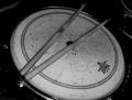
| 04/09/2003 11:57:05 PM |
sobered snareby mjc155Comment: Lost on the theme of color here? Would make a good pi submission. The cropping on this one is too tight. Cut off some of the drum. More DOF to bring the drum detail and sticks more into focus. I like the lighting and lines on the drum. |
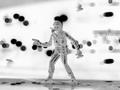
| 04/09/2003 11:55:02 PM |
ThE rEAL coLorrrS!by angelComment: I think I am thinking too hard on this one, trying to get the meaning. I like the photo and the possibilty that war is not all black and white but alot of grey too?? But for this color challenge I don't get it. Still gonna get a 5 though |
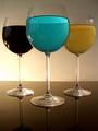
| 04/09/2003 11:52:40 PM |
Red White and Blueby TiNComment: Nice idea. The colors seem a bit muted (red looks black). i don't like the light in the background, looks great across the table, but brings out distractions on the wall. A little more DOF so the back glasses have more clarity. |
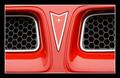
| 04/09/2003 11:49:35 PM |
The Alien.by buzzrockComment: Pretty red. Looks like an old Trans Am or Firebird (I had a '72 FIrebird). Little tighter focus and it seems out of balance just a bit. Totally centered would look much better to me. |
 Photographer found comment helpful. Photographer found comment helpful. |
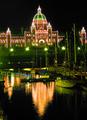
| 04/09/2003 11:47:27 PM |
Fire on the Waterby f-32Comment: Very Nice reflection. The lights on the building seem a little blurred. Night shots are hard to get great focus when bright lights are there. still a good job. |
| Photographer found comment helpful. |
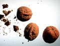
| 04/09/2003 11:39:05 PM |
3.14159265 walnutsby Pep VentosaComment: Very original. decent focus, but maybe a touch more DOF to detail the 0.1415 guys. I would like to see just a hint of light on the darker side to...just a touch. |
| Photographer found comment helpful. |
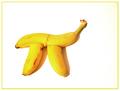
| 04/09/2003 11:36:59 PM |
Banana Piby jodiecostonComment: Very good idea. A bit on the bright side, but the colors look great. I would like to see it a bit sharper and cropped down some. Maybe tilted up on the right side some? |
| Photographer found comment helpful. |
| 04/09/2003 11:33:56 PM |
Solid Silver Piby drydocComment: Nice eye to see the pi. The sky is blown out, but not surprised if that is the only angle to get it at. The silver area seems a bit bright too. How would this look in black and white? and making it more "contrasty," or high key? |
| 04/09/2003 11:31:05 PM |
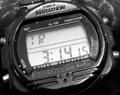
Time For Piby rickhd13Comment: Excellent idea! Never thought of that one. Would like to see it a bit sharper. Little dust spots or something all over. How would this look in high key? |
| Photographer found comment helpful. |
| 04/09/2003 11:28:11 PM |
Play doh Piby CreativeFlyPhotoComment: Appears to have good DOF, but the light seems to wash out all detail on the Pi sign. Not sure if that is intentional to make it appear to glow or not. I like the way it blurs the farther up it goes. The frame is good in color, but I am not a fan of them. Not that I deduct for it. |
| Photographer found comment helpful. |
Home -
Challenges -
Community -
League -
Photos -
Cameras -
Lenses -
Learn -
Help -
Terms of Use -
Privacy -
Top ^
DPChallenge, and website content and design, Copyright © 2001-2026 Challenging Technologies, LLC.
All digital photo copyrights belong to the photographers and may not be used without permission.
Current Server Time: 07/17/2026 03:21:50 AM EDT.