| Image |
Comment |
| 05/25/2003 05:01:10 PM |
They control our lifeby pitsamanComment: My eyes seem to be drawn more towards the back here. I think I would like to see more DOF, mainly because my eye seems to be drawn away from the colored/focused area(??) |
 Photographer found comment helpful. Photographer found comment helpful. |
| 05/15/2003 11:31:06 PM |
Kindergarten Simpleby RiderGalComment: If you were looking to get something that looks totally made in an image editor, you did it. Good job, but it is a tad boring. Muted coloring for my taste |
| 05/15/2003 11:25:52 PM |
|
| Photographer found comment helpful. |
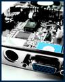
| 05/15/2003 11:22:18 PM |
Primary Coatrackby myqylComment: Great concept. Focus looks good. I think maybe taking the shot from lower angle and shooting up to have the white wall behind it and get the grey carpet out would have given more impact. Doesn't affect the score, but the border is hideous! |
| Photographer found comment helpful. |
| 05/15/2003 11:18:32 PM |
|
| 05/15/2003 11:14:45 PM |
Confusion. Which Shall I Choose?by RefocusedComment: Great idea and original. I think the contrast could come up some . Just a bit dull in the colors. A touch more diffuse lighting may have boosted the color and made it a bit more vibrant. Not that it matters on my scores, but I hate the border. |
| Photographer found comment helpful. |
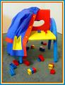
| 05/15/2003 11:10:25 PM |
Out come the heroesby johnmkComment: That is just freaky looking. First look at it and it looks like it is a digitally PS block picture. Il ike the lighting/shadow and the way it looks like he is waiting to come on the court. If you also made this out of legos, personally, I am EXTREMEly impressed. |
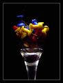
| 05/15/2003 11:07:26 PM |
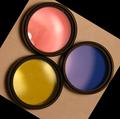
Untitledby jab119Comment: Nice idea. A touch more diffuse lighting to bring out the detail on the rings a touch more. Most likely said before, but the cropping may have been better with a little more space around the filters to see the full shadows and even(ing) out the spacing, and then the rotation part not sure of, but making it a bit more symmetrical again with like a diamond in a square |
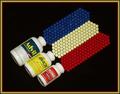
| 05/15/2003 11:01:26 PM |
Early Primary Colorsby ploogieaComment: Great colors and perspective. A touch brighter would help in my opinion. the horizon line is off a bit goin up from right to left. |
| Photographer found comment helpful. |
| 05/15/2003 10:59:15 PM |
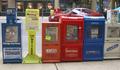
Colorful Newsby eloiseComment: The perspective seems odd. It looks like it is squeezing at the bottom of the photo. The right side is sort of flaring to the right and left to left as it goes up. Is messing with my eyes. |
| Photographer found comment helpful. |
Home -
Challenges -
Community -
League -
Photos -
Cameras -
Lenses -
Learn -
Help -
Terms of Use -
Privacy -
Top ^
DPChallenge, and website content and design, Copyright © 2001-2026 Challenging Technologies, LLC.
All digital photo copyrights belong to the photographers and may not be used without permission.
Current Server Time: 07/18/2026 03:37:37 AM EDT.