| Image |
Comment |
| 07/25/2010 06:37:16 PM |
|
 Photographer found comment helpful. Photographer found comment helpful. |
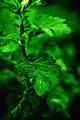
| 07/25/2010 06:26:13 PM |
Ready To Leaveby MsAmbrosiaComment: I love the green in this but I prefer the complementary colors of the original. I also think you could have cropped off the top leaf to get rid of the bright spot and still have had an effective image. |
| Photographer found comment helpful. |
| 07/23/2010 08:10:26 AM |
|
| Photographer found comment helpful. |
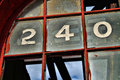
| 07/22/2010 09:29:26 PM |
240by Yo_SpiffComment: i think there is more attention grabbing stuff in this one. |
| Photographer found comment helpful. |
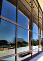
| 07/22/2010 02:43:04 PM |
Reflectionsby Yo_SpiffComment: Oh yeah, big improvement over the original. The reflection is good. The subject itself does not move me too much so I am giving this a 6. |
| Photographer found comment helpful. |
| 07/21/2010 09:05:49 AM |
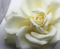
A Pure Scent by Librodoby loveComment: this is pretty, and i like the soft lighting, but I prefer Librodo's shot. the crop focuses purely on the flower where here, you have extra elements (in particular the top left) that don't add anything to the shot. |
| Photographer found comment helpful. |
| 07/21/2010 09:04:05 AM |
Root Of All Evil - 464725by libertyComment: even tho the original was for a "bad" challenge, this is a good re-do. no date stamp (lol), looks good in color, no flash, and i like the focus on the coins. |
| Photographer found comment helpful. |
| 07/21/2010 09:01:23 AM |
Soaringby sfaliceComment: yes, a better interpretation of the original. i like that you chose to include a background to supplement the subject. |
| Photographer found comment helpful. |
| 07/21/2010 08:57:13 AM |
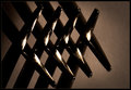
nivlek's intersectby idealoddsComment: not a bad interpretation. i like how the criss-cross patterns are more apparent in this. just that the way you set it up, the intersection leads my eye to the empty space, and the photo seems incomplete. with the original, the empty space leads me to the intersection. yeah, sounds weird, so sorry lol. |
| Photographer found comment helpful. |
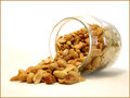
| 07/21/2010 08:53:55 AM |
Apple Skin, original by dbortoby dbortoComment: interesting interpretation. i like how the glass seems to be floating. i actually prefer the lighting and white balance of the original, plus that the apple skin is more prominent there too. |
Home -
Challenges -
Community -
League -
Photos -
Cameras -
Lenses -
Learn -
Help -
Terms of Use -
Privacy -
Top ^
DPChallenge, and website content and design, Copyright © 2001-2026 Challenging Technologies, LLC.
All digital photo copyrights belong to the photographers and may not be used without permission.
Current Server Time: 06/24/2026 05:12:25 AM EDT.