| Image |
Comment |
| 02/14/2003 05:14:29 AM |
|
| 02/12/2003 05:33:11 AM |
WOW! A Still Life!by MarkRobComment: Greetings again from the Critique Club
an after thought I just noticed this remark in your comments
"set aperature and then played with the shutter speed until my EV level was 0." I fee that your ev would have been better at 0.7
did you try this as a landscape crop?
|
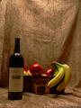
| 02/12/2003 04:13:14 AM |
WOW! A Still Life!by MarkRobComment: Greetings from the Critique Club
This is a nice try at a still life arrangement, but would have benefited by having more light on the arrangement an a little less on the background.
The background distracts the eye from the main subject
Your camera work is good, the main problem with this image is the lighting.
Some suggestions to try
Play around with the lighting, more on your arrangement less on the background.
With out re shooting the image try cropping in closer to the top of the bottle and playing around with the brightnes and contrast settings. |
 Photographer found comment helpful. Photographer found comment helpful. |
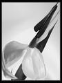
| 02/11/2003 03:47:53 AM |
Ode to Mapplethorpeby KarenBComment: Greetings from the Critique Club
Composition: An interesting slant on an often photographed subject! Congratulations on being brave enough to convert it to black & White and change it from the mundane to the unusual!
I would have liked a little more room around the crop though, Part of the point appears to be missing and it is to tight on the left.
Background: Works for this image
Camera work : Overall a good sharp photo with a good tonal range, although the petal at the lower left is slightly out of focus I cant make up my mind if this detracts or actually adds another focal point!
Digital processing: Not overworked, just right!
My Opinion I like this, it makes a statement to me and everytime I go back and look at it something new grabs my interest.
|
| Photographer found comment helpful. |
| 02/11/2003 03:34:17 AM |
King Flame's Courtby magnetic9999Comment: Greetings from the Critique Club
Composition:
To my eye the composition of this image is very good the only thing that I would have liked to have tried would have been to place the burnt match slightly lower in the frame.
Background: This would not have been as effective against any other colour background.
Camera work: Good, colours correctly exposed, the smoke leading the eye from one point of interest to the other. May be a little more light on the burnt match.
Digital processing: Not intrusive or overworked!
My Opinion!
What more can I say but congratulations on producing an imaginative and well shot image that fits the challenge exactly.
|
| Photographer found comment helpful. |
| 02/06/2003 01:39:05 AM |
Square Feetby kellymcgComment: Greetings from the Critique Club
Subject
Can I identify the subject? Most definitely the lovely rusty Red Square in the foreground!
Did the subject grab My attention? Most definitely!
Sharpness:
How important is sharpness to this photo? The most important element of this photo is in focus and is complemented by the blur of the background.
Exposure: May be a little dark if you want to nitpick!
Contrast & Color: Very good lovely warm rust inthe foreground.
Composition
The various elements of the photo are well balanced within the frame?
And as you look at the photo your eyes are drawn to the subject.
Suggestions for improvement:
Hard as I think this is very good as is but perhaps bracket to lighten the exposure a bit.
|
| 02/05/2003 06:25:48 AM |
Cubedby mariomelComment: Greetings from the Critique Club
Subject definitely meets the Square challenge! An interesting image, I wish I knew what the chain cage was for!
The image is very bright though with the snow and the car window in the background causing harsh highlights and a flare respectively.
Suggestions for improvement
Try taking at different time of day when the sun is not so high. Also I see that your ISO is 160 it would have been better to use 100 or lower if your camera has it. Also setting the ev a stop lower might have helped. Did you adjust the levels in an image editing program.
But congratulations on an interesting shot! |
| Photographer found comment helpful. |
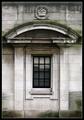
| 02/04/2003 03:15:25 AM |
Royal Decayby ManicComment: Greetings from the Critique Club
A good Photo of Architectural detail, but it is just technically good it doesn't have that little bit extra that say Wow!
It is a little overexposed in the middle did you use a flash close up?
I feel that it might have helped the flatness if it had been black and white I can see a good tonal range possibilities in this, all that lovely decay and the straight lines.
Well tried, it probably would have done better in the square challenge where no enhancements were allowed.
|
| 01/31/2003 12:30:50 AM |
at the end of the tunnelby BeeGeeComment: Greetings from the Critique Club
Subject
The subject grabs your attention, And definitely meets the challenge!
Sharpness:
focus is excellent, pin sharp
Exposure: Good
Contrast & Color: A little flat, but I think that is more the subject matter than your fault!
Composition
The various elements of the photo would be better balanced within the frame, if you had not got the flat spots on top and bottom. As you look at the photo your eyes are drawn to the subject down the tunnel, clever use of vingetting
Suggestions for improvement
Dont crop the top and bottom flat! I would have preferred a slightly less busy view at the bottom of the tunnel
Overall very creative and well executed.
|
| Photographer found comment helpful. |
| 01/31/2003 12:21:33 AM |
Not a dropby DezComment: Greetings from the Critique Club
Subject
The subject is easily identifiable as a glass but I feel it would have, both looked and met the challenge better had it been at least half full of milk.
Sharpness: The image is nice and sharp which I feel is important to this single subject photo?
Exposure: Contrast & Color: I think the original exposure was probably more correct than it is now after photoshopping to get the background an even black. The mug now looks rather dingy and gray.
Composition I think the composition is good As you look at the photo you get an almost 3d effect of the mug you almost want to put your hand out and grab it! I liked your minimalistic approach to the challenge!
Suggestions for improvement
Milk in the cup! Better lighting and less adjustments in photoshop.
May I conclude by saying that I thought this would do better than it did!
|
Home -
Challenges -
Community -
League -
Photos -
Cameras -
Lenses -
Learn -
Help -
Terms of Use -
Privacy -
Top ^
DPChallenge, and website content and design, Copyright © 2001-2026 Challenging Technologies, LLC.
All digital photo copyrights belong to the photographers and may not be used without permission.
Current Server Time: 07/22/2026 10:32:31 AM EDT.