| Image |
Comment |
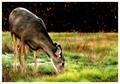
| 12/04/2007 10:52:51 AM |
White-Tailed Doe by riversongComment: Very pretty - almost Bambi like! The soft focus combined with the luminous effect was a good choice. |
 Photographer found comment helpful. Photographer found comment helpful. |
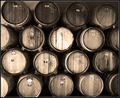
| 12/04/2007 10:51:30 AM |
Yummy!by TommyMoe21Comment: On a purely subjective and personal level, I just don't find photos of children eating appealling in any way. If I cover over the hand spoon and mouth you have a lovely portrait, but as soon as I see the rest it changes my view dramatically. I do, though look forward to more photos of the same model with the same style of processing. |
| Photographer found comment helpful. |
| 12/04/2007 10:11:07 AM |
Vintageby RissaComment: An interesting find, and the sepia treatment suits the subject and title. i do find the bright spot on the upper centre barrel rather distracting, though. |
| Photographer found comment helpful. |
| 12/04/2007 08:02:04 AM |
|
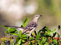
| 12/04/2007 08:01:11 AM |
Mocking Birdby zclareComment: Super photo of a bird in its natural environment, with a background that allows the bird to stand out well. It may be worth slightly subduing the bright spot behind the bird's head. |
| Photographer found comment helpful. |
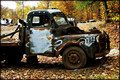
| 12/04/2007 07:59:43 AM |
Old & Rundownby bs-photosComment: An interesting subject with bags of potential for an entire series of photographs! The border suits the photo well, drawing the eye in. I suspect this was taken in harsh light, as the shadows are quite short but very dark - it might be interesting to retake at different times of the day, if thta is a possibility. Compositionally, the sideways on truck acts as something of a barrier - it may have been preferrable to take the photo with the truck at more of an angle, which would allow for the viewers eye to be led into the photo more. |
| Photographer found comment helpful. |
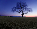
| 12/04/2007 07:54:41 AM |
Aloneby BudComment: The lone tree with its winter bareness looks wonderful against the twilight blue sky. I do wonder why you included quite so much foreground; for me it adds little to the composition. Did you consider taking the photo from a more distant viewpoint? The inclusion of a little more sky at the top would give the tree a bit more space and prevent the composition feeling cramped. |
| Photographer found comment helpful. |
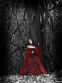
| 12/04/2007 07:50:24 AM |
Sleepy Hollowby mystical_princessComment: I like the dark and gothic feel to this and the selective desat works well. I do feel that the model looks a little self-consciously awkward, and I would have preferred a less centered composition - others may prefer it as it is. |
| Photographer found comment helpful. |
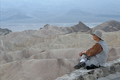
| 12/04/2007 07:48:11 AM |
Zen photographyby claudia26Comment: The figure gazing into the distance in this almost surreal landscape works well and the minimalist like composition (unusual in landscapes)lends itself well to your title. As a personal preference, though, I would prefer that the camera was not visible as it adds just a little clutter and thus diminishes the impact slightly. |
| Photographer found comment helpful. |
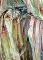
| 12/04/2007 06:49:29 AM |
Abstractby bigdipperComment: What an interesting find, and I can quite see why you were drawn to photograph it. The muted colours swirling into each other are amazing, and I find myself studying the picture to look for identifiable shapes, in much the same way as I look at flames in a fire. There is a real sense of movement about the image, despitethe fact that it is of something entirely static. For this particular photograph I do feel that you needed somewhat sharper focus - I suspect the light may have been such that you rellay needed the use of a tripod. |
| Photographer found comment helpful. |
Home -
Challenges -
Community -
League -
Photos -
Cameras -
Lenses -
Learn -
Help -
Terms of Use -
Privacy -
Top ^
DPChallenge, and website content and design, Copyright © 2001-2026 Challenging Technologies, LLC.
All digital photo copyrights belong to the photographers and may not be used without permission.
Current Server Time: 06/21/2026 10:07:05 PM EDT.