|
|
|
Showing 4181 - 4190 of ~6709 |
| Image |
Comment |
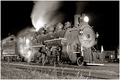
| 11/12/2008 03:55:02 PM | Midnight at Furnace Hillby MaverickComment: Hello from the Critique Club.
Firstly, this was a photo that impressed be during voting for the FS, and I am pleased to be revisiting it to leave a fuller critique than my earlier comment.
Composition: The diagonal placement of the tracks adds a a sense of motion, despite the (apparently) stationary engine and the low viewpoint adds to the sense of it's imposing size, although at the cost of the inclusion of the foreground grasses - that said, whilst I don't feel they add anything positive, I don't find them as distracting as I did when I first viewed the photos. It is a shame that the modern suburban housing is so visible in the background, although reading your photographer's notes, I suspect this is something you cannot avoid.
Exposure: I viewed your photo the Night Train, and could see why you wanted to try a re-shoot - and I am glad you did, because the exposure here is spot on. All of the train is well exposed, with the only burned out areas in the whitest and brightest part of the steam. The detail revealed in the train is really good; I wonder if you could capitalise on this even further with a little selective burning?
Focus and sharpness: Clearly good focus, with just the right amount of post-processing sharpness. The depth of field has allowed the entire train to remain in focus.
Monotone Conversion: There is a good range of tonal values from true black through to white.
Overall impression: A very well considered and taken photograph, with complimentary post-processing - I am surprised it didn't score above 6, as I thought it one of the stronger entries in this months FS.
|  Photographer found comment helpful. Photographer found comment helpful. |
| 11/12/2008 07:50:42 AM | Nambucca Headsby vladoComment: Hello from the Critique Club.
What a wonderful find this scene was! I find the photograph quietly pleasing - it doesn't have the wow factor so beloved of DPC, but there is a gentleness and serenity to it that other members have commented on. You have presented the photo well, with a semi-panoramic crop, which suits the scene. The composition is well balanced, with the jetty leading the eye in. I particularly like the way the texture of the water changes behind the jetty - a little detail, but one that adds to the viewer's pleasure. The exposure is good with just enough detail in the shadows, and displays the light beautifully. Your choice of shutter speed was also good for the image; any slower and you would lose the gentle ripples that add greatly to the ambience.
Really, I have no suggestions for improvements of the photo as is, or if you were to re-shoot - other than perhaps the addition of a small boy with fishing line dangling his legs over the jetty edge!
You mention that you may have over-processed the photo - that certainly isn't evident to me! All in all, a photograph that I have enjoyed viewing. If you you have any questions about this critique, feel free to drop me a PM.
Regards,
Sara. | | Photographer found comment helpful. |
| 11/10/2008 02:48:49 PM | Flowers of Lightby alpharichComment: Hello from the Critique Club.
Your subject choice of long-exposure fireworks was a good one for the challenge, with masses of motion blur! I am confused by the votes of 1 and 2 - I can only think that they are from people new to photography who have never tried to photograph fireworks and are under the illusion that the photo doesn't meet the challenge...
What I like: The vibrancy and zest of the fireworks - I can almost smell and hear them.
What I am not so keen on: There is almost too much here, with a chaotic, slightly muddled composition - perhaps a shorter shutter speed with fewer firework explosions captured might be more aesthetically pleasing - a case of less is more. The very long shutter speed has also resulted in a couple of blown out areas which do draw the eye.
All-in-all, a decent photo that fits the challenge well.
Regards,
Sara.
PS - hope you didn't sell your lenses - you have some good photos in your portfolio. | | Photographer found comment helpful. |
| 11/10/2008 08:12:57 AM | Flowers: $8.99 Falling in love: priceless by mbrutus2009Comment: Hello from the Critique Club.
I am sure that this photo ended up scoring far worse than you had expected. I am quite sure that the end score was as a result of what many viewers clearly perceived as, at best, a tenuous link to the challenge theme. Had you entered the same photo in to the monthly Free Study I suspect you would have finished a full point and more ahead.
Technically the photo is competent, although there are things that could be worked on to bring it up another notch. Focus is sharp on the centre and near petals, falling off with distance. Exposure is on the dark side - if you were going for a low-key look, you achieved your aim, if not, you may want to try exposing more to the right of your histogram. The black background provides a sombre and somewhat harsh foil to the rose, although it does allow the red to be seen to good effect. My main problem with the photo is with the composition - and this is just my personal, subjective view - which feels to me somewhat awkward. The stem is just visible, and I actually find myself trying to follow it out of the photo, there either isn't enough of it therem, or there is too much. If you are to include part of the stem, I feel that a more diagonal composition would be worth considering.
All in all, a competently taken photograph that missed the mark in terms of the challenge. I look forward to seeing more of your flower photographs as you develop further.
Regards,
Sara. | | Photographer found comment helpful. |
| 11/10/2008 07:52:02 AM | | | Photographer found comment helpful. |
| 11/08/2008 09:16:05 PM | respectby clangley50Comment: Way under-appreciated. The photo may have some technical issues, but the wonderful moment you have captured transcends them. Beautifully observed moment. |
| 11/08/2008 09:00:43 PM | Your Face Here, Inc.by muur88Comment: Not as strong as Death and Laundry, perhaps, but nonetheless worthy of a much, much higher score than 5.5. | | Photographer found comment helpful. |
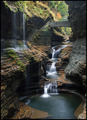
| 11/08/2008 05:02:48 AM | Fallsby smichenerComment: An awesome photograph - aesthetically pleasing, with bags of interest. Congrats on the top 10 finish. | | Photographer found comment helpful. |
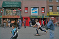
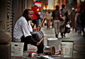
| 11/07/2008 08:22:35 AM | Sound of the Streetsby Pipe_DreamComment: Hello from the Critique Club.
This is a strong image, and has rightly placed well in the challenge. You have broken with the B&W tradition of street photography, and I feel that was a wise decision - the colour gives this a real sense of vibrancy which suits the scene well. Your choice of depth of field is spot on, isolating the drummer whilst keeping the background sufficiently identifiable to provide context and complete the 'story'. And it is the 'story' that makes this photo such a success - the strange collection of implements the busker has gathered together, the shoppers passing with their bags and clear material wealth which all combine to provide a compelling narrative, and encourage the viewer to stay longer.
There are only a couple of things that detract for me: there is a softness of focus on the face of the drummer, most noticable on his forehead; as identified by another commenter, the bright yellow blob is somewhat distracting; and the image is a tad over-sharpened for my tastes.
My overall impression is of a well considered photograph thta delivers what the photographer intended. It is one I would have been proud to have captured.
If you any questions about this critique, please feel free to PM me. regards, Sara. | | Photographer found comment helpful. |
| 11/06/2008 02:51:08 PM | | | Photographer found comment helpful. |
|
Showing 4181 - 4190 of ~6709 |
Home -
Challenges -
Community -
League -
Photos -
Cameras -
Lenses -
Learn -
Help -
Terms of Use -
Privacy -
Top ^
DPChallenge, and website content and design, Copyright © 2001-2026 Challenging Technologies, LLC.
All digital photo copyrights belong to the photographers and may not be used without permission.
Current Server Time: 06/26/2026 02:41:01 PM EDT.
|