| Image |
Comment |
| 11/15/2008 02:32:28 PM |
|
 Photographer found comment helpful. Photographer found comment helpful. |
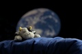
| 11/15/2008 02:32:08 PM |
Moolandingby djoekComment: The colour blue is in the composition, but seems to me incidental. the concept is amoosing, but the implementation hasn't quite worked - the blue fabric looks too much like a piece of cloth thrown over an armchair; just doesn't quite work for me. |
| 11/15/2008 02:29:31 PM |
Beach Glassby dsternerComment: This doesn't quite hit the mark for me. The composition is a little dull - the pieces of glass neither form a strong pattern, nor are random, and for my tastes their is a little too much negative space to the bottom of the frame. |
| Photographer found comment helpful. |
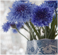
| 11/15/2008 02:27:59 PM |
Cornflower blueby heavenlyComment: Oh, this is lovely - pretty and romantic. I would have liked just a little more room above the cornflowers, but nonetheless a photo I like very much. |
| Photographer found comment helpful. |
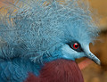
| 11/15/2008 02:27:01 PM |
Blue Crowned Pigeonby karenkComment: What an amazingly unlikely bird - never seen anything like it before! Good choice for the challenge. |
| Photographer found comment helpful. |
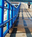
| 11/15/2008 02:26:09 PM |
Azulby got2bgutsyComment: Not a photo that holds my attention. The character walking towards the camera seems somewhat accidental rather than an integral part of the composition. |
| Photographer found comment helpful. |
| 11/15/2008 02:24:17 PM |
|
| Photographer found comment helpful. |
| 11/15/2008 02:05:23 PM |
Only One Is Sealed.by jomariComment: I think this a really pretty and romantic still life. I'm not quite convinced by the backcloth, and would probably prefer something a little softer. nonetheless, a very pleasing photo. |
| Photographer found comment helpful. |
| 11/13/2008 02:33:37 PM |
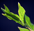
Chlorophyl Factory Hard at Work!by 777STANComment: Hello from the Critique Club.
This is a bold photo, with a simple but strong composition and feel. The choice of blue background contrasts and compliments the green of the leaves well, although it might be better if the blue of the background was smoother - if I tip my screen right back, the background becomes much darker, and that looks really cool! The back-lighting is lovely, and I can quite see why you were drawn to photograph them. I do feel that the central leaf, the bright one that draws the eye, could be in a little sharper focus; that said, I can see that it is a tricky job to get sharp enough focus on the critical parts whilst still throwing the subsidiary parts into a soft blur. The diagonal composition was a good choice.
With a smoother and deeper, darker background I suspect this would have scored better. A simple subject such as these leaves needs to be technically perfect to hit the right buttons with the viewer - for me, it is a case of very nearly there. |
| 11/13/2008 08:07:54 AM |
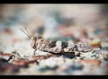
Camouflage!by FocusPointComment: Hello from the Critique Club!
Hi Leo,
First Impressions: An interesting natural history photo with a lovely colour palette that made me laugh. I voted this a 7, which means I was pretty impressed with it first time round!
Composition: This is one area where I think you could probably improved on. As it is, it is ok, but just sort of 'there'. A little more room for the bug to look in to would be one idea, also to have taken the photo with it angled slightly towards you rather than very slightly away from you. That said, it is a realtively minor quibble.
Focus/Sharpening: Both are spot on, and the depth of field is perfect with a gorgeous medly of shapes and muted colours in the back and foreground.
Exposure: Again, to my eyes, and on this un-calibrated monitor, spot-on. It may be that on a bright-screen monitor it may appear a little over-exposed.
Overall Impression: Having looked at this photo in some considerable detail, I still stand by my original thoughts. I am at a loss to know why it scored so badly, and can only conclude that some people find the subject a turn-off. Win some, lose some, I guess.
If you have any questions, please feel free to PM me.
Regards, Sara. |
| Photographer found comment helpful. |
Home -
Challenges -
Community -
League -
Photos -
Cameras -
Lenses -
Learn -
Help -
Terms of Use -
Privacy -
Top ^
DPChallenge, and website content and design, Copyright © 2001-2026 Challenging Technologies, LLC.
All digital photo copyrights belong to the photographers and may not be used without permission.
Current Server Time: 06/26/2026 01:19:18 PM EDT.