| Image |
Comment |
| 10/22/2007 05:31:40 AM |
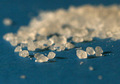
Saltby dsternerComment: Deb - salt is a very touch subject for photography - especially without very well controlled light and a good macro lens. Salt itself is very cool - it looks like little grains but is not uniform or cubic like you think. If you were to use a significant magnification (reverse lens mount or higher power macro lens) you would be on to something.
Salt is a rather plain target for a shot and the technicals (lighting, color, focus, composition, etc) all have to be outstanding to really come off.
Things I noticed:
1. The noise problems that others have commented on really impacted the score. The image appears muddy throughout
2. Your image has a very shallow DOF that made the image appear very muddy and the area in-focus was not extremely sharp. By shooting at the low angle, you have added to the shallowness of the DOF.
3. The composition really does not draw me in - there are no specific lines to pull the eye. By taking the salt an manipulating it so it forms a specific shape may have helped - say an s-Curve where the in focus salt is right in the foreground and the "S" leads your eye away
I hope this stuff helps!
Peter
|
 Photographer found comment helpful. Photographer found comment helpful. |
| 10/21/2007 10:36:51 PM |
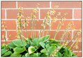
Old Hostaby BlueZamiaComment: the colors don't seem really vibrant and the hosta seems to get lost (especially the yellowing blooms) in the brick wall. Boosting the local contrast with something like USM at 25,50,0 might really separate the flower from the background. |
| Photographer found comment helpful. |
| 10/21/2007 10:34:19 PM |
|
| Photographer found comment helpful. |
| 10/21/2007 10:33:07 PM |
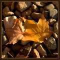
Two Leavesby BlueZamiaComment: very good control of exposure and use of available light to bring out the textures of these leaves - well done |
| Photographer found comment helpful. |
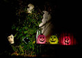
| 10/21/2007 10:29:24 PM |
Happy Halloween!by colorcarnivalComment: it looks like your neighborhood has a blast at halloween - thanks for sharing all these - they are all great |
| Photographer found comment helpful. |
| 10/21/2007 10:27:54 PM |
|
| Photographer found comment helpful. |
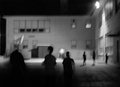
| 10/21/2007 10:27:10 PM |
Shadow Peopleby colorcarnivalComment: very spooky! - this looks like a still from 'night of the living dead'
it almost seems like the figure in the far left has no head...yikes! |
| Photographer found comment helpful. |
| 10/21/2007 10:25:03 PM |
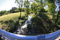
IMG_0109bridge640.jpgby BalkoComment: i seriously love the super high contrast of this IR image - not only did you use multiple lenses, you had multiple cameras.
i think you win for most gear on a walkabout! |
| Photographer found comment helpful. |
| 10/21/2007 10:23:54 PM |
|
| Photographer found comment helpful. |
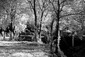
| 10/21/2007 10:23:01 PM |
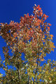
IMG_0258tree640.jpgby BalkoComment: nice bright blue sky - the light is a little harsh for leaf peeping but we can't be picky can we!! |
| Photographer found comment helpful. |
Home -
Challenges -
Community -
League -
Photos -
Cameras -
Lenses -
Learn -
Help -
Terms of Use -
Privacy -
Top ^
DPChallenge, and website content and design, Copyright © 2001-2026 Challenging Technologies, LLC.
All digital photo copyrights belong to the photographers and may not be used without permission.
Current Server Time: 06/20/2026 06:41:17 AM EDT.