| Image |
Comment |
| 10/24/2007 09:55:43 AM |
|
 Photographer found comment helpful. Photographer found comment helpful. |
| 10/24/2007 09:53:41 AM |
|
| Photographer found comment helpful. |
| 10/24/2007 09:52:35 AM |
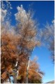
Autumn Treesby riversongComment: i like the feel of this image - wispy and soft but there is no specific item to really draw me into the photo |
| Photographer found comment helpful. |
| 10/24/2007 09:51:08 AM |
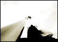
Railway to Heavenby matoComment: cool repeating lines and curves - but the crop leaves me wanting less - less sky! I would have liked more of the building |
| Photographer found comment helpful. |
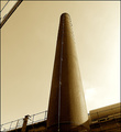
| 10/24/2007 09:50:18 AM |
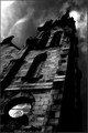
Not so long ago..by docjonnyComment: cool chimney - the issue I have with the image is the building that is just in view in the upper left. This is where my eye keeps getting drawn to. If the shot had been more at a diagonal, it my hold a bit more interest |
| Photographer found comment helpful. |
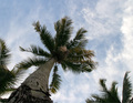
| 10/24/2007 09:48:47 AM |
What! No Coconut!by danielcheong1974Comment: I love palm trees - the image doesn't quite seem in balance as if the palm is about to fall over. Also, the lighting seems a bit flat and the colors are not especially vibrant |
| Photographer found comment helpful. |
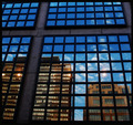
| 10/24/2007 09:47:14 AM |
reflectby mrsamsaComment: i like the theme created by the lines - very cool stuff! |
| Photographer found comment helpful. |
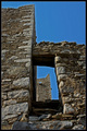
| 10/24/2007 09:44:56 AM |
stone towersby chimaeraComment: cool perspective but the edges of the sky have a significant amount of halo present as if overprocessed |
| Photographer found comment helpful. |
| 10/24/2007 08:55:03 AM |
Rainbow in the leaves after the rain.by JLCComment: What an extremely cool image - the blue sky, the purples in the blurred leaf and the greens, reds, etc in the backlit leaf - very cool stuff - 7 for photographic vision |
| Photographer found comment helpful. |
| 10/24/2007 08:53:55 AM |
The Rainbow Flagby sfaliceComment: very nice colors and composition - too bad about the sensor dust in the left corner |
| Photographer found comment helpful. |
Home -
Challenges -
Community -
League -
Photos -
Cameras -
Lenses -
Learn -
Help -
Terms of Use -
Privacy -
Top ^
DPChallenge, and website content and design, Copyright © 2001-2026 Challenging Technologies, LLC.
All digital photo copyrights belong to the photographers and may not be used without permission.
Current Server Time: 06/21/2026 01:42:25 AM EDT.