| Image |
Comment |
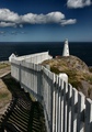
| 10/02/2007 07:10:10 PM |
Cape Spear Lightby KarenNfldComment: One of the best I've seen thus far. Beautiful whites, leading lines, shadow and focal point. 10. |
 Photographer found comment helpful. Photographer found comment helpful. |
| 10/02/2007 07:09:14 PM |
Mr. Buzzby keoneComment: Wow - that's close! Something seems a little off on the yellow, though - like it has a green undertone. |
| Photographer found comment helpful. |
| 10/02/2007 07:08:33 PM |
Saraby lovethelightComment: Interesting lines - I like how the eyebrows match the bend of her knees. Great perspective, too. 8. |
| Photographer found comment helpful. |
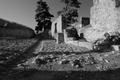
| 10/02/2007 07:07:53 PM |
venetian casteby cheopeComment: I'm mixed on this one. I like the leading lines a lot. I also like the mood. I'm not sure you quite captured the full tonal range, though, and the right-hand tree is distracting. Still an interesting entry! |
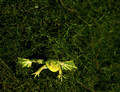
| 10/02/2007 07:06:44 PM |
Now Where's the Fly?by CharleneComment: This looks like a plastic frog stuck in a rosemary plant or similar. The position is pretty good, and the lighting not bad, but the subject itself doesn't do much for me...sorry. |
| Photographer found comment helpful. |
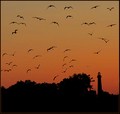
| 10/02/2007 07:05:42 PM |
Lookout for the Birdsby skewsmeComment: An interesting mixture of pretty sunset and somewhat ominous feeling with so many birds (thanks, Hitchcock!) |
| Photographer found comment helpful. |
| 10/02/2007 07:04:52 PM |
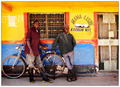
Karibu Tenaby cregoComment: Great travel photo! The colors are really vibrant here. |
| Photographer found comment helpful. |
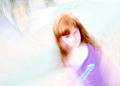
| 10/02/2007 09:23:30 AM |
Intensityby levyj413Comment: Jeffrey - I appreciate the risk you took entering this photo, and the fact that both Neil and Deb really like it says a lot. This one does not work for me overall - I'm not a fan of the colors, and I think the lines leading away from the turquoise/greenish design on her shirt pull the eyes right out of the photo. I do like her facial expression and the sense of motion apart from the aforementioned turquoise lines. In the end I think it's very cool that you entered this instead of a "safe" photo. You probably knew you'd get hammered, but hopefully you'll get some interesting comments - and you already have one fave, right? |
| Photographer found comment helpful. |
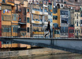
| 10/02/2007 09:15:46 AM |
Gironaby kolasiComment: I'm having trouble deciding if this one works for me or not. I love the buildings and colors. I think the placement of the subject on the bridge isn't the best, but I also realize this is a street photo and you can't direct your subject to a certain place... |
| Photographer found comment helpful. |
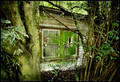
| 10/02/2007 09:07:47 AM |
r e j e c t e dby RetroesqueComment: This is one of those photos that makes the viewer want to know more. I'd really like to enter that building and poke around. Great colors and slight spooky emotive. |
| Photographer found comment helpful. |
Home -
Challenges -
Community -
League -
Photos -
Cameras -
Lenses -
Learn -
Help -
Terms of Use -
Privacy -
Top ^
DPChallenge, and website content and design, Copyright © 2001-2026 Challenging Technologies, LLC.
All digital photo copyrights belong to the photographers and may not be used without permission.
Current Server Time: 07/27/2026 04:53:11 AM EDT.