| Image |
Comment |
| 03/11/2009 07:56:58 PM |
[ D E P T H ]by ericwooComment: Love the DOF here. Great capture of the texture of the rocks as well. Well exposed and interesting colors. The angle chosen definitely gives a feeling of depth. Good job. |
 Photographer found comment helpful. Photographer found comment helpful. |
| 03/11/2009 07:55:48 PM |
Fleurby photoman78Comment: A few blown highlights (from what I see...then again this monitor is a bit on the bright side). Nicely saturated colors and good choice for background. It would be nice if the stem and leaf had a bit more light on them or if possible if they could be removed altogether. |
| Photographer found comment helpful. |
| 03/11/2009 07:54:29 PM |
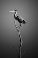
the Oneby valioooComment: Great choice for black and white conversion. I love the tones in the image. Great sharpness and effective composition. |
| 03/11/2009 07:53:39 PM |
|
| Photographer found comment helpful. |
| 03/11/2009 07:52:51 PM |
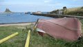
On an Islandby wallEComment: interesting shot but really tough lighting to work with. A polarizer would help with the glare on the rock but there's not a lot you can do about the harsh shadows. |
| 03/11/2009 07:51:47 PM |
Mona Lisaby sidpixelComment: I would sooo tempted to call this Moona Lisa. But that would be cheesy. :)
Fun capture and one that I'm sure will be memorable for most people. |
| Photographer found comment helpful. |
| 03/11/2009 07:51:03 PM |
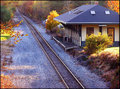
RURAL STATION - HEADING NORTHby whitewolfComment: A little oversaturated and oversharpened in my opinion. A good way to boost saturation naturally with good effect is selecting cloudy for your white balance. It will warm up the colors nicely without resulting in unnatural looking colors. |
| Photographer found comment helpful. |
| 03/11/2009 07:49:45 PM |
Lindisfarne Castleby cthulhuComment: Nice shot and interesting composition. I think with a bit of levels adjustment this image would really pop. It might be just me but the horizon doesn't quite look straight to me. |
| Photographer found comment helpful. |
| 03/11/2009 07:48:10 PM |
Golden Hourby onesaintComment: Not really sure what I am supposed to be looking at. The tree take up half of the image and yet it appears you are trying to photograph the cityscape. The building on the left in the foreground is also a bit distracting. I would like to see this shot without the tree and the building. |
| Photographer found comment helpful. |
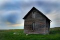
| 03/11/2009 07:46:34 PM |
Abandoned Farm Houseby markpomerleauComment: I think leveling the picture according to the horizon would have helped. The house has a lean to it anyways so why not go with it?
Love the sky and the colors you captured. The reds are a bit oversaturated however. Overall a pretty solid image. |
Home -
Challenges -
Community -
League -
Photos -
Cameras -
Lenses -
Learn -
Help -
Terms of Use -
Privacy -
Top ^
DPChallenge, and website content and design, Copyright © 2001-2026 Challenging Technologies, LLC.
All digital photo copyrights belong to the photographers and may not be used without permission.
Current Server Time: 06/23/2026 02:26:30 PM EDT.


![[ D E P T H ]](https://images.dpchallenge.com/images_challenge/1000-1999/1005/120/Copyrighted_Image_Reuse_Prohibited_772199.jpg)