| Image |
Comment |
| 09/07/2009 10:47:56 PM |
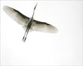
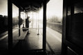
Owl-Reduxby bassboneComment: I am so jealous. I can hear an owl or two in my vicinity but I have never seen them. Normally I am not a fan of Topaz but its effective here (mainly because it wasn't overdone) |
 Photographer found comment helpful. Photographer found comment helpful. |
| 09/02/2009 11:27:14 AM |
Avian Angel by SandyPComment: Congrats (again) on your blue. Sorry for not offering congratulations sooner. (I just realized that it got reinstated)
|
| Photographer found comment helpful. |
| 08/27/2009 06:00:18 PM |
|
| Photographer found comment helpful. |
| 08/26/2009 03:05:14 PM |
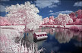
Cotton Candy by marboComment: I've done some IR shots and they never seem to look anything like this. How do you get the pink and the blue? |
| Photographer found comment helpful. |
| 08/25/2009 10:18:47 PM |
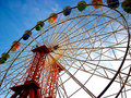
Milson Pointby KristinatorComment: Greetings from the critique club!
Great subject for the challenge. Nice colors in the wheel. It looks like you shot from the shadowed side. If so I am curious what this would like shot from the brighter lit side.
The colors are nice but it does look like you increased the saturation a bit too much. (I am guessing since the processing details weren't provided. For next time, if you request a critique its a good idea to provide them).
Your composition works well with the subject. The radial lines of the wheel take your eye to the middle of the wheel. The lines on the outside take us out then back into the frame which some might dislike but I personally like in this case.
Overall, a really strong entry for your first challenge. |
| 08/21/2009 07:14:34 PM |
Liquid Sculptureby basssman7Comment: man...you did get whacked by the anti-drop brigade. I mean its not the best drop picture ever but its still pretty darn good. Then again, I never get tired of water drop pictures. |
| Photographer found comment helpful. |
| 08/20/2009 09:06:19 PM |
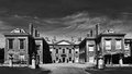
Bleak House by Charles Dickensby alpharichComment: Greeting from the Critique Club!
This shot certainly meets the challenge and connects well with the title you chose. (I think that was the only "challenge' in this challenge - take a picture and find a book that suited it) The monochrome look works to give this shot a bleak feeling. Nice dramatic look to the sky as well.
It appears that you were aiming for symetry but didn't quite achieve it. I can imagine it was hard to shoot as there was probably people around. It would have been nice to get some space on both sides.
Overall a pretty decent shot. |
| Photographer found comment helpful. |
| 08/19/2009 02:05:16 PM |
Waitingintherainby MelethiaComment: Just checking your march to 300 challenges and came across this. Great shot Deb! Message edited by author 2009-08-19 15:13:45. |
| Photographer found comment helpful. |
| 08/18/2009 02:42:40 PM |
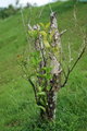
Life After Deathby SHALIGAComment: Greetings from the critique club.
Interesting take on the challenge theme. Unfortunately, the subject is hard to make stand out amongst the other entries in the challenge.
As for how it was shot: It appears that you had an overcast day to work with which helped provide more even lighting. I'd be curious to see how this would look if it was shot closer to the golden hour (i.e. right around dawn or dusk).
To be honest it doesn't look like a lot of time was put into considering the composition. The subject is stuck in the middle with the branches sticking out of the frame. There is nothing wrong with your subject extending into the frame just make sure its deliberate and not accidental and its done to enhance your image.
As one commenter suggested, moving to get rid of the sky or adding a lot more of it might have worked well. Remember, that the eye is drawn to the brightest part of a scene. In this case, the eye is drawn to the top of the frame away from what you wanted us to look at.
Overall, not a bad image especially for your second challenge. I look forward to seeing more of your image. |
| 08/18/2009 02:31:20 PM |
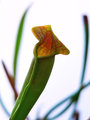
Living Death (Feeed meee!)by itsamioComment: Greetings from the critique club.
Interesting find but I the connection to the challenge could be stronger. Granted, its a carnivourous plant but most viewers wouldn't know that. (I didn't either until I read your submission details). That's not saying there is no connection but the image is a bit of a shoehorn.
The background is quite bright and the subject itself is relatively dark due it being backlit. A reflector or a bit of flash may have helped.
The use of a large aperture was great as it blurred out the details in the background nicely. As Jason_cross indicated, the placement of the subject within the scene in relation to the background elements works really well.
The colors are pretty good but they would probably pop more if the subject was better lit.
Overall? Not bad at all for your first challenge entry and I hope to see more of your work in future challenges. |
Home -
Challenges -
Community -
League -
Photos -
Cameras -
Lenses -
Learn -
Help -
Terms of Use -
Privacy -
Top ^
DPChallenge, and website content and design, Copyright © 2001-2026 Challenging Technologies, LLC.
All digital photo copyrights belong to the photographers and may not be used without permission.
Current Server Time: 06/22/2026 04:41:38 PM EDT.