| Image |
Comment |
| 03/11/2010 03:01:07 PM |
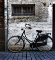
The bicycleby RUEDISCHMUTZComment: really good image that is pleasing to look at. I'd like to see a bit more space on the right behind the back tire. |
| 03/11/2010 03:00:00 PM |
|
 Photographer found comment helpful. Photographer found comment helpful. |
| 03/10/2010 09:35:34 PM |
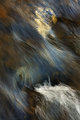
Umbrella for A Windy Dayby JeffryZComment: very intriguing shot. This has an otherworldly almost whimsical feel to it. The tiled horizon actually adds to the feeling |
| 03/10/2010 12:10:19 AM |
Parallelism in Daily Life by hManComment: I guess that's what happens when two challenges are run in parallel... alright very bad joke.
Great take on parallel lines though. I think a bit more depth of field would help make the leading lines more apparent to help take us into the frame. I also wonder what this would look like if shot from a slightly lower angle. |
| Photographer found comment helpful. |
| 03/10/2010 12:05:19 AM |
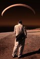
Escape by shankswareComment: I didn't really get a chance to look at the entries for this challenge but I like the idea you've presented here and you've executed it quite well I think. Congrats on the red! Message edited by author 2010-03-10 00:05:33. |
| Photographer found comment helpful. |
| 03/09/2010 06:31:14 PM |
_MG_5957wm.jpgby Photomom1981Comment: Baby needs a bit of separation from the background. The chair back looks oddly attached to her head |
| 03/08/2010 02:08:53 PM |
Natalyby albc28Comment: This was a strange free study. Some decent images, this one included, got hammered and I don't see why |
| Photographer found comment helpful. |
| 03/08/2010 01:57:07 PM |
Hinomaruby Yo_SpiffComment: great abstract image. I love the colors and the composition |
| Photographer found comment helpful. |
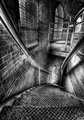
| 03/05/2010 12:48:20 AM |
Descentby franktheyankComment: I love the monochrome conversion that was done. There's a lot of dodging and burning on this but it really works well with this image. |
| Photographer found comment helpful. |
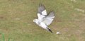
| 03/04/2010 08:47:16 PM |
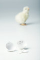
Doveby theONE77Comment: Greetings from the Critique Club!
My first impression is that the image is bit out of focus. I have that lens and I find that unless the subject is still its hard to good a good lock sometimes. I am guessing from the crop that you weren't all that close. Filling the frame would have made a stronger image. As one of the comments below suggests, I would crop out the fence in the lower left as it is an unwanted element. Also, since you have cropped anyways, you could crop this so that the subject isn't dead center.
As this was basic editng there is nothing you could do about that white object in the yard however. Exposure is pretty good. The background is a little flat and lacks contract but I'm not sure how you could do a lot about that. I like that you chose f/8 so you got the whole bird in focus. Based on the settings and what I am seeing it looks like you had some pretty harsh light to work with which may have hurt the image as well.
In terms of the challenge? This doesn't scream garden to me. This is a picture of a bird. The fact that it was taken in your garden is only revealed by what you wrote in the photographer's comments. I believe that also hurt the score somewhat. |
Home -
Challenges -
Community -
League -
Photos -
Cameras -
Lenses -
Learn -
Help -
Terms of Use -
Privacy -
Top ^
DPChallenge, and website content and design, Copyright © 2001-2026 Challenging Technologies, LLC.
All digital photo copyrights belong to the photographers and may not be used without permission.
Current Server Time: 06/22/2026 01:34:24 AM EDT.