| Image |
Comment |
| 03/07/2007 08:39:54 PM |
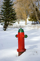
On Guardby candlerainComment: A simple subject and an interesting idea. The colors of the subject are rich and nicely saturated.
The composition is a bit dull. Getting lower would help for starters. Moving the hydrant off center would also help. Get a bit closer to give the subject more prominence in the shot or try getting away from the hydrant and relying its color to bring the eye to it.
The background of the picture is distracting. Using a larger aperture would allow you to blur out the background.
This hits the nail on the head for meeting the challenge. |
 Photographer found comment helpful. Photographer found comment helpful. |
| 03/07/2007 08:32:50 PM |
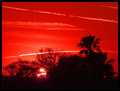
Cherry Sunsetby nickersh2oComment: I really like the concept of this shot. The clouds (jet streams?) add interest to the sky and create leading lines that take your eye across the picture. The composition works for me and I like the overall curve of the tree line.
This would work better with greater sharpnesss in the trees. Their edges are a little soft so the silhouette effect isn't as strong as it could be.
The trees around the sun are also a little hot. Not much you can do under basic but I thought I would mention it.
Definitely worthy of this challenge and is a fresh take on the challenge. It makes a bold statement |
| Photographer found comment helpful. |
| 03/07/2007 08:26:40 PM |
Redby gregmComment: The highlights are blown out here. I can't see any details in the foreground. The chipmunk in the left tree is cute but I wonder why you cropped his tail. Your horizon is also quite skewed.
That aside this is also quite blurry. I would recommend using a tripod and/or turning up the ISO and using a faster shutterspeed.
This certainly meets the challenge. |
| 03/07/2007 05:48:27 PM |
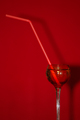
Straight Upby keith_nComment: Nice composition in this shot. The straw creates an interesting diagonal line to take your eye around the picture. The goblet portion of the wineglass is positioned well.
The picture does have a bit of a two dimensional feel to it. Perhaps a third element close or further away would add some depth. You could also show red floor/ground to add depth as well.
The glass could be sharper. Perhaps a smaller aperture could help create greater depth of field so the entire glass is sharp. It appears that autofocus may have used the straw as the focus point.
Interesting approach to the challenge that is certainly unique. |
| Photographer found comment helpful. |
| 03/07/2007 05:38:52 PM |
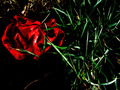
Still Lifeby DigiFotoBuddyComment: The sharpness of the central blossom is quite nice. It captures a lot of good detail and creates good foreground interest. The depth of field applied to the overall picture works and help create three dimensional space.
The background color is a little distracting. Perhaps a slightly darker shade of red would help.
The border is a little thick and detracts from the image. The rose hip on the right side is kind of "stuck" into the frame. It would be nice to have a bit of separation.
While there are many roses shown in this challenge this one takes a unique approach with the dried blossoms. |
| Photographer found comment helpful. |
| 03/07/2007 05:31:11 PM |
delictby messerschmittComment: Nice bold colors in this shot. Composition is a little lacking. There isn't anything on the right side to help balance the red object. (What is it by the way?). As such the object drags the eye to the left part of the frame.
The bold contrast is a good idea but the picture does seem to be a bit dark.
Interesting approach to the challenge. The abstract nature of the object creates visual appeal. |
| Photographer found comment helpful. |
| 03/07/2007 05:28:12 PM |
Beauty in Redby RetusnavyComment: Interesting composition. I like the lines of the leaves. They take your eye around the picture nicely. The central group of blossoms anchors the shot nicely and creates nice foreground interest.
The shot could be a bit sharper. If a tripod wasn't used I'd recommend one. The colors seem a little bit oversaturated.
This certainly meets the challenge. Perhaps not the most creative idea but its fresh enough to work. |
| Photographer found comment helpful. |
| 03/05/2007 12:28:56 AM |
SNAFU by muckpondComment: I could have sworn I voted on this one. Apparently I didn't. It met the challenge well and it was cool to look at. Of course it didn't hurt that you shot it well too...
Congrats on the ribbon! |
| Photographer found comment helpful. |
| 03/05/2007 12:14:44 AM |
UnUseDby TheStickComment: Sorry...why spell your title that way? It really takes away from your photo. |
| 03/05/2007 12:13:04 AM |
|
| Photographer found comment helpful. |
Home -
Challenges -
Community -
League -
Photos -
Cameras -
Lenses -
Learn -
Help -
Terms of Use -
Privacy -
Top ^
DPChallenge, and website content and design, Copyright © 2001-2026 Challenging Technologies, LLC.
All digital photo copyrights belong to the photographers and may not be used without permission.
Current Server Time: 06/25/2026 08:40:34 PM EDT.