| Image |
Comment |
| 05/05/2008 06:22:44 PM |
An Odd Threeby battymaddieComment: Greetings from the critique club!
This has been mentioned before but I'll reiterate anyways. I think the only problem with this shot is the lack of separation between the drops forming the three and the background. Perhaps larger drops might have helped. One thing I did pick up on which I appreciate is that you printed the background backwards so that the words would be mirrored in the drops and therefore display correctly. I also agree that a shallower DOF would have helped. (I wonder how it would have turned out at f/2.8?) |
 Photographer found comment helpful. Photographer found comment helpful. |
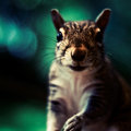
| 05/05/2008 06:19:04 PM |
Slothby choltmeierComment: Greetings from the critique club!
Tough guy to expose for. It would be really nice to get more detail in his hair. Great colors in this shot a nice composition that effectively draws your eye to the animal's face. Looking at this further the highlights work well as rim lighting which further emphasizes the subject. As an aside, it would be nice if the commenter below supplied more information on WHY they gave this shot a 2 because I don't feel it deserves anything less than a 6. |
| Photographer found comment helpful. |
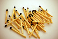
| 05/05/2008 06:12:26 PM |
Odd or Even?by bibuComment: Nice even lighting that works well here. I'd like to see a bit more space at the bottom. I'm not sure if the match heads have been burned or if they are simply dark. I think that red match heads would work better here.
In terms of the challenge, I would say that this even only in terms of numbers. The random placement of the match sticks seems to say Odd to me more. Perhaps it you laid them side by side and bottom to bottom it would add to that feeling of "evenness". |
| Photographer found comment helpful. |
| 05/05/2008 06:08:31 PM |
A different family portraitby RiderGalComment: Greetings from the Critique club!
Another unique and interesting take on this challenge. I like the panoramic layout here. I'm curious how this would like if it were shot from a lower angle. (This angle does work since you've placed the horizon well above them). Overall a pretty good image. The only thing hurting it is perhaps the size however that can't be helped under this ruleset. |
| Photographer found comment helpful. |
| 05/05/2008 05:43:24 PM |
Odd way out.by meneleComment: Interesting take on the challenge. Lighting is a little harsh however, as you mention the shadows do help give the tablets some form. Good use of shallow DOF here as it helps bring attention to your main subject as does your composition. |
| Photographer found comment helpful. |
| 05/05/2008 05:40:54 PM |
Five Spokeby bonez318tiComment: Greetings from the critique club!
Interest approach to the challenge. I like the crop you used here. Make sure that you take advantage of the full allowed size (640 px max in this case). I think if it had been bigger you would have scored higher as users tend to slam under sized images.
Good choice of aperture here as it give a good feeling of depth without sacrificing a lot of sharpness.
Overall, a good image and a nice start to your dp challenge career. |
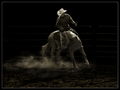
| 05/05/2008 01:58:58 PM |
Cowboy Games by LydiaComment: Strange but when I looked at this home with a calibrated monitor, I didn't the light reflecting off the top of the pipes in the fence. Here at work too, I see more contrast between subject and background. Anyways, congrats on your blue and PB! |
| Photographer found comment helpful. |
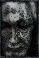
| 05/05/2008 12:51:36 AM |
The Deceiver by KronusComment: Really interesting textures with nice hints of color. The border really works well here too. edit to add: Really different than your other stuff. Good on you for trying out new approaches. Message edited by author 2008-05-05 00:52:43. |
| Photographer found comment helpful. |
| 05/04/2008 03:28:05 AM |
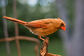
forthebirds5.jpgby cynthiannComment: This one is a little dark and perhaps oversharpened. I like the two bird shots you uploaded more I think. |
| Photographer found comment helpful. |
| 05/04/2008 03:26:27 AM |
|
| Photographer found comment helpful. |
Home -
Challenges -
Community -
League -
Photos -
Cameras -
Lenses -
Learn -
Help -
Terms of Use -
Privacy -
Top ^
DPChallenge, and website content and design, Copyright © 2001-2026 Challenging Technologies, LLC.
All digital photo copyrights belong to the photographers and may not be used without permission.
Current Server Time: 06/25/2026 07:08:39 AM EDT.