| Image |
Comment |
| 01/05/2007 03:03:38 PM |
Engulfment Hazardby posthumousComment: I hardly know what to say. I love this composition, but don't know why. Everything about it pleases my eye. Someone said it is busy. I think it is infinitely interesting. I gave it a 10. |
 Photographer found comment helpful. Photographer found comment helpful. |
| 01/05/2007 02:39:42 PM |
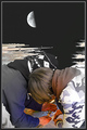
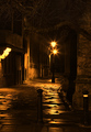
No Giant Stepsby raishComment: The thing that I find distracting in this image is the large negative space in the upper right quadrant of the picture caused by the straight line of the half moon leading directly down to the left bank of the fjord. And I am confused by the abstract black and white of the fjord vs the very realistic foreground with the boys/men.
The odd thing is that those same things are what I like about the image. I just think I would like them in separate shots. The abstract of the fjord and moon would be good as one, and the boys/men would be good in another. Or the boys and moon without the fjord.
I have no problem with the quality of the image on my monitor. Larus probably has a much finer setup than I do. |
| Photographer found comment helpful. |
| 01/05/2007 01:56:40 AM |
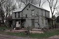
Home, Sweet Home!by NikonJebComment: You captured an amazing scene here. This is a harsh environment for sure. What really gets to me in this image are the flags decorating the front of the house. There is still some life and joy in this pitiful shambles of a home.
I gave this a 6, because the image seems to be a little flat. I don't know if you used HDR or some expert editing techniques to create this effect deliberately, but this sometimes happens to my pictures when I use Shadows/Highlights. I find that if I use Exposure after s/h, and tweak offset and/or gamma ever so slightly, the photo pops back to life. Also,I think saturating red a little more would bring some color to the brown areas without destroying the harshness of the scene.
This scored quite well, considering nobody has quite figured out what to make of these Expert rules. Too bad SkyNavada didn't give you that 8 he thought you deserved. And a FAV! Woohoo. |
| Photographer found comment helpful. |
| 01/04/2007 11:54:46 PM |
|
| Photographer found comment helpful. |
| 01/04/2007 11:15:03 PM |
|
| Photographer found comment helpful. |
| 01/04/2007 11:13:03 PM |
|
| Photographer found comment helpful. |
| 01/04/2007 11:00:16 PM |
Delicateby IvoryComment: This seems over sharpened. It's still a marvelous shot. |
| Photographer found comment helpful. |
| 01/04/2007 10:53:57 PM |
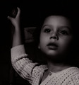
Sitting Prettyby whiteroomComment: This is such a good photo. The girl is lovely and so demure. The colors and textures are wonderful. 10 and favorite. |
| Photographer found comment helpful. |
| 01/04/2007 12:18:03 AM |
The Web Within the Webby noranekoComment: Catherine,
You're right; our patterns are very similar. It's eerie that the two shots are side by side in the Team Suck thread. I also noticed that we were both using a pattern on top of another pattern to create additional patterns. Needless to say, I like your shot. And I like the black and white treatment. Sorry I can't think of anything to improve it. |
| Photographer found comment helpful. |
| 01/03/2007 11:49:28 PM |
Love my AAsby snafflesComment: I think the dark shadow on the face and throat are disturbing. On my monitor they are so dark that it looks like the body is deformed, and it gives the mouth an unpleasant expression. Also I think the crop on the top is a little tight -- too close to the batteries. These are all technical issues. The idea is fun and OOB, which is what we like on Team Suck. Good try. |
| Photographer found comment helpful. |
Home -
Challenges -
Community -
League -
Photos -
Cameras -
Lenses -
Learn -
Help -
Terms of Use -
Privacy -
Top ^
DPChallenge, and website content and design, Copyright © 2001-2026 Challenging Technologies, LLC.
All digital photo copyrights belong to the photographers and may not be used without permission.
Current Server Time: 06/22/2026 01:33:54 AM EDT.