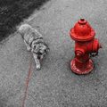
| Image |
Comment |
| 05/28/2007 11:24:11 AM |
Matronby MelethiaComment: Deb, I loved this one and gave it a 9. I think it is an excellent use of selective desat. Without the desat, the mannequin blends into the background too much and the whole image is a jumble. You got a pretty good score for this considering that it is very off-beat. I think many voters just thought WTF and moved along quickly. |
 Photographer found comment helpful. Photographer found comment helpful. |
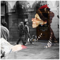
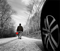
| 05/28/2007 11:14:01 AM |
love triangleby posthumousComment: I like your processing a lot on this shot. The composition bothers me a little, because the red line leads my eye down and off the page. I understand it is leading to the unseen 'master', but it still feels uncomfortable. I think this was an excellent example of good selective desat. The color is great, and I like the b&w tones. |
| Photographer found comment helpful. |
| 05/28/2007 10:50:40 AM |
Hibiscusby NikonJebComment: Jeb, I think there are several things that hurt your score.
1. While the bloom is lovely, the color is lovely, and you did a very good job on the selective desat, the photo doesn't seem to be improved by the process. In other words, I doubt you would have used this technique on this photo if it wasn't the challenge topic.
2. Even thought you desaturated the background, there are elements in the background that still conflict with the blossom -- e.g. the two light gray items behind the blossom.
3. I think there is too much b&w in the bottom of the image. It might be better if the bottom was cropped to just below the bud making the aspect ratio almost square. The other alternative would be to leave the size as it is, and color the bud which might balance the composition better.
Hope this helps. Of course, it is just my very amateur opinion.
|
| Photographer found comment helpful. |
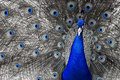
| 05/28/2007 01:46:18 AM |
Primary Feathersby noranekoComment: Eleventh! Aarg, so close. You deserved a star on this shot. It's marvelous. I would never have thought of using selective desat on this photo, because the peacock colors are so wonderful, I'd hate to lose any of them. But this really works. Congratulations. |
| Photographer found comment helpful. |
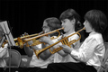
| 05/28/2007 01:35:38 AM |
Brassyby levyj413Comment: Jeffery, she looks so cute in this shot. I think the selective desat would have been more effective if you had left just your daughter's horn in color. Then the photo would have been about her playing the horn and not the horns. |
| Photographer found comment helpful. |
| 05/28/2007 01:26:24 AM |
|
| Photographer found comment helpful. |
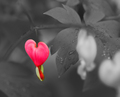
| 05/28/2007 12:19:59 AM |
Transfusionby bmartuchComment: Bob, the bleeding heart is beautiful. This may not have been a good choice for selective desat, because the image doesn't seem to be improved by the b&w. The heart would have stood out nicely against the green, so the question is: why was the green removed? |
| Photographer found comment helpful. |
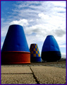
| 05/27/2007 02:53:45 PM |
Who's a pretty buoy ?by fredandaudComment: Don't like the border, but not subtracting for that. I think simple black would have been effective and wouldn't have competed with the image for attention. |
| 05/25/2007 03:00:31 PM |
"E" is for Exerciseby bassboneComment: Just revisiting some of your shots. I never told you I think this is marvelous, and it made me LOL. Love the spot color. I gave this a 9 during voting. |
| Photographer found comment helpful. |
| 05/24/2007 10:09:31 PM |
|
| Photographer found comment helpful. |
Home -
Challenges -
Community -
League -
Photos -
Cameras -
Lenses -
Learn -
Help -
Terms of Use -
Privacy -
Top ^
DPChallenge, and website content and design, Copyright © 2001-2026 Challenging Technologies, LLC.
All digital photo copyrights belong to the photographers and may not be used without permission.
Current Server Time: 07/16/2026 10:25:31 PM EDT.