| Image |
Comment |
| 06/13/2006 07:16:40 PM |
Standing in the shadowby fredandaudComment: For a photo to do really well in a challenge called "Shadows", those shadows must play a major role in the image. In this case, they are secondary at best.... several other elements create the impact. |
| 06/13/2006 07:12:57 PM |
Shadow Diningby graphicfunkComment: Whilst, for a number of reasons, the "illusion" isn't at all convincing, the idea is still cute. 7 |
 Photographer found comment helpful. Photographer found comment helpful. |
| 06/13/2006 07:11:24 PM |
|
| Photographer found comment helpful. |
| 06/13/2006 01:45:38 PM |
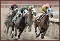
The First Turnby coolharComment: Wow, fantastic improvement here. This shot has punch and purpose.
Certainly deserves the awesome score it got. |
| Photographer found comment helpful. |
| 06/13/2006 01:35:46 PM |
|
| Photographer found comment helpful. |
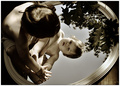
| 06/13/2006 01:33:38 PM |
Child in Nature ~ Mirrors Redux by jenesisComment: This is magnificent. I wish I had seen this when my girls were babies. Somehow I don't think copying this techniques with a 15 year old would be quite the same.
Well done!! |
| Photographer found comment helpful. |
| 06/13/2006 01:28:56 PM |
Water Drop Revisitedby RikkiComment: Pat on the back, Rikki. I really like this one. It is so classy in an understated way. The gradient is wonderful! |
| Photographer found comment helpful. |
| 06/13/2006 01:26:56 PM |
Still Inseparableby DefyTimeComment: I agree with Jenesis.
I like the shadows of #2, but prefer the original for everything else. |
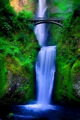
| 06/13/2006 01:23:25 PM |
Return to Multnomahby DrAchooComment: Other than the border, the original photo was superb!!
The post processing in this is way too much, and I miss the log :-(
|
| Photographer found comment helpful. |
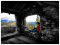
| 06/12/2006 08:40:53 PM |
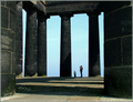
thinking of what lies aheadby RikkiComment: Since you asked in a thread......
I dare to differ from the general after-challenge praise, sorry.
I didn't score it, but would have given it a 5 or a 6, and here is why:
The b+w inside jumped out at me as having been desaturated. It's not in keeping with the true nature of the place. By looking so unnatural and "wrong", it holds my attention and achieves the exact opposite of what you were trying to achieve (as per your notes). I would have preferred to see it left the natural color, but perhaps darkened a little if that was necessary.
Much of the sky is blown and the colors outside look over saturated to me.
This whole photo is really all about the view, not the empty room. It fits the challenge, but only in a happenstance way.
|
| Photographer found comment helpful. |
Home -
Challenges -
Community -
League -
Photos -
Cameras -
Lenses -
Learn -
Help -
Terms of Use -
Privacy -
Top ^
DPChallenge, and website content and design, Copyright © 2001-2026 Challenging Technologies, LLC.
All digital photo copyrights belong to the photographers and may not be used without permission.
Current Server Time: 06/16/2026 09:29:42 AM EDT.