| Image |
Comment |
| 01/11/2006 12:34:28 AM |
Measuring Shapeby graphicfunkComment: As soon as I saw this photo, my very first thought was: "that one is grapicfunk's".
Then i looked at it closer. Still thought that the hand and that wonderful POV looks soooooooo much like it must be his, but Daniel would NEVER submit something like that. There are two MAJOR flaws in this photo, so it couldn't possibly be his.
Couldn't help but smile when I read your words, Daniel.
I can feel your pain, and yet you still made it to 14th place!!!!!
Not bad at all to get 6.5 for something you're not happy about, huh?
|
 Photographer found comment helpful. Photographer found comment helpful. |
| 01/10/2006 07:28:50 PM |
IMG_3004.jpgby JOHNBOY1970Comment: Yes, you're right, that is exactly what it looks like - it was my first thought as soon as I spotted this thumbnail. Well spotted. |
| Photographer found comment helpful. |
| 01/09/2006 12:48:55 PM |
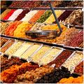
Color balanceby alexgarciaComment: I had a similar photo to this (except even more colorful because it was in a candy store) but decided not to submit it as it doesn't really fit the description. There is a difference between a colorful photo and "colorful impact to offset your subject from the rest of the photograph" |
| Photographer found comment helpful. |
| 01/09/2006 12:46:08 PM |
Flower Burstby SandyPComment: The effect you have applied here makes your photo fit the challenge description very well, but I find it too unnatural to enjoy it. |
| Photographer found comment helpful. |
| 01/09/2006 12:44:37 PM |
Mantlepieceby shamrockComment: Hmmm... the negative space is growing on me as I am looking at the photo, brave idea. Since you chose to chop off parts of vase and flower, I think you should have gone that little bit further and NOT have included the bit of background space to the right of the vase.
The shadows from the flash are too harsh. Try bouncing your flash or using a diffuser. |
| Photographer found comment helpful. |
| 01/09/2006 12:40:36 PM |
Kid's Colorby nowlinComment: I have a few suggestions that I think might improve this photo:
1) use a plain colored background 2)include the whole structure - the chopped off bits are bothering me 3) try more even lighting - the shadows are distracting 4) make sure it is clean - I keep looking at the stain on the yellow rod 5)submit the photo with (at least close to) 640 pixels on the long side. |
| 01/09/2006 12:36:06 PM |
|
| Photographer found comment helpful. |
| 01/09/2006 12:35:01 PM |
|
| Photographer found comment helpful. |
| 01/09/2006 12:30:36 PM |
Chromatic Eruptionby kteachComment: Wonderful idea, very effective and attrative. Your attention to accuracy and detail paid off. Nice lighting, too - if the shadows were stronger, they would be distracting. My only gripe is the angle of the frames. They are only just "off" enough to be annoying. Either straight or a more prounounced angle would have looked better. |
| Photographer found comment helpful. |
| 01/09/2006 12:26:29 PM |
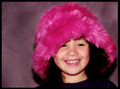
Hot Pinkby mystical_princessComment: Cute model. The shadows from the flash are too harsh, next time try bouncing it or using a diffuser. |
| Photographer found comment helpful. |
Home -
Challenges -
Community -
League -
Photos -
Cameras -
Lenses -
Learn -
Help -
Terms of Use -
Privacy -
Top ^
DPChallenge, and website content and design, Copyright © 2001-2026 Challenging Technologies, LLC.
All digital photo copyrights belong to the photographers and may not be used without permission.
Current Server Time: 06/19/2026 05:15:00 PM EDT.