| Image |
Comment |
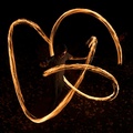
| 10/19/2006 01:06:57 PM |
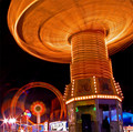
Friedby aaronwaveComment: Great shot of the fair. Nice use of lighting and colors. I am a little intrigued by the the swooping light in the bottom left corner. The spinning top is really cool and reminds me of a wicker basket. 9. |
 Photographer found comment helpful. Photographer found comment helpful. |
| 10/19/2006 01:04:47 PM |
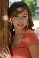
M a g i c L i g h tby tonodzComment: The model is pretty and though there are various areas of increased/decreased lighting, I don't really like where the lighting is hitting (fings and left of head). The bright sunlight forming the dot to the left side draws my eyes there (to a wood pole) first rather than to the model as the subject. There is also a bright dot on the head/hair rather than one near the face that would draw me to the subjects' face.
This is a great composition and a nice portrait but the lighting just needs to be adjusted a bit IMO. |
| Photographer found comment helpful. |
| 10/19/2006 12:57:12 PM |
Melba-Liteby ernstlindeComment: Title helps. Thanks. It is like a nice piece of abstract art hanging in a gallery. It is refreshing to see some people be creative here where you don't have to take a shot of a sunrise/sunset to make a good "lighting" photo. 8. |
| Photographer found comment helpful. |
| 10/19/2006 12:55:07 PM |
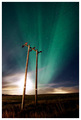
Dark lightingby DjabordjaborComment: The lighting is great. I'm not a fan of the power lines running right through the middle of them though. It's a little distracting. Great colors in the shot though. |
| Photographer found comment helpful. |
| 10/19/2006 12:47:08 PM |
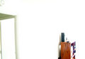
Mourningby perotyComment: The image is just too bright for my tastes. Certainly is using light (per challenge) but the bookcase is blown out along with some highlights of the door. |
| 10/19/2006 12:45:37 PM |
|
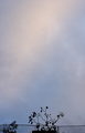
| 10/19/2006 12:45:06 PM |
Lightby maria_fernandaComment: Very nice photo. The rays of sunlight are nice and visible. good contrast of greys and whites. The photo moves me as a viewer and makes me think of a religious advertisement. Maybe something like "Be Still and Know that I am your God". Nice job. 9. |
| 10/19/2006 12:41:05 PM |
Reaching for lightby quiet_observationComment: I like the use of negative space but the subject at the bottom do not really draw me to it. It needs something a bit more bold at the bottom IMO. |
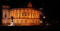
| 10/19/2006 12:40:12 PM |
City Hall at Nightby minniedentComment: This is a nice image and good illustration of the lighting challenge criteria.
The areas I see where this could be improved are: (just my opinion of course)
The white base of the statue is a bit stronger contrast to the yellowed building then i might prefer. The image is also offset based ont he crop. The negative space to the right does not really enhance the photo so by vertically cropping closer to the building (maybe by the street light), I think the image would present itself better. |
| Photographer found comment helpful. |
| 10/19/2006 12:36:43 PM |
Holy Enlightenmentby mdloweComment: The image does not appear to be in focus and the big dark dot around the area of the cross is a bit distracting. |
Home -
Challenges -
Community -
League -
Photos -
Cameras -
Lenses -
Learn -
Help -
Terms of Use -
Privacy -
Top ^
DPChallenge, and website content and design, Copyright © 2001-2026 Challenging Technologies, LLC.
All digital photo copyrights belong to the photographers and may not be used without permission.
Current Server Time: 07/17/2026 11:40:01 AM EDT.