| Image |
Comment |
| 11/24/2004 05:02:42 PM |
Hard November Windby kaske666Comment: this got my highest vote in the challenge (9). I love this kind of stuff, and you executed it smashingly.
P |
 Photographer found comment helpful. Photographer found comment helpful. |
| 11/24/2004 12:51:40 PM |
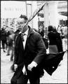
Three Weeks Newby jenesisComment: ahhhhhhh! whadda punkin! Congratulations on the new addition Jen. He's perfect. looking forward to lots more photos.
not sure why this photo didnt score better, other than in general people are basically stupid.
P
ps a camera is a great first b-day gift. |
| 11/18/2004 01:10:16 PM |
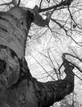
Nativeby jpetersComment: this is one of the better conversions i've seen in this challenge. nice a rich and deep texture, an element most have missed. In advanced editing you could dim the reflections a little, but they're not too bad at all.
nice shot. love the shallow DOF too.
P Message edited by author 2004-11-24 00:14:43. |
| Photographer found comment helpful. |
| 11/18/2004 01:08:20 PM |
Hidden Beautyby PaigeComment: Hi Taylor :) Tell your mom she takes fabulous photos of you.
P |
| Photographer found comment helpful. |
| 11/18/2004 01:04:16 PM |
Reach for the Skyby maknbaconComment: when you're shooting the sky directly, you're best to expose the photo for the sky (which will underexpose the rest of the image) and the bring up the detail on the rest with post processing. once the details are blown out (overexposed), you can't get them back no matter what you do. err on the side of underexposure. This is WAY easier in advanced editing, but can be done with levels and/or curves in software like photoshop.
i like the composition, like the title. nice shot.
P |
| 11/18/2004 01:01:12 PM |
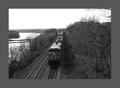
Heading Northby cdn1Comment: you only get a maximum of 640 pixels to display your photo...a 35 pixel border eats up about 15% of your viewing area. So regardless of what people think of your border colour etc, you're not giving them a chance to see the image.
The pic itself is not bad. They call those '255 skies' which means overexposure has turned them white and lost all their detail. In an image like this you're best to underexpose a little, then bring the detail up in post processing (WAY easier in advanced editing using the dodge tool).
Another goofy observation about the title: in general people associate north with up, so this train would appear to be going south, in the absence of any other information to identify it. (learned that in a marketing class once :))
Good luck.
P |
| Photographer found comment helpful. |
| 11/18/2004 12:50:57 PM |
Many Shades of Greyby ty_roniComment: here's another one that I really wish was under advanced editing rules. there are lots of great things going on in this image, most of which are lost in the conversion to BW. The ability to dodge and burn would actually show the subtleties you captured. nice shot |
| Photographer found comment helpful. |
| 11/17/2004 12:28:56 PM |
Pensive Pauseby lynnesiteComment: screw the anti-duotone people. I LIKE IT! I'd add at least one full point to the score you're getting, and that's what it *should* have received, but the anal-ysts will mark you down i'm sure.
I love this image. great directional lighting from the sun - you positioned them just right in my opinion. I'd prefer if the crop were tighter, or if the boys weren't right in the middle of the frame; I figure if you want the surroundings in the frame - give them the chance to shine. If you *don't* want them in...crop 'em out. just my opinion. really like the shot.
P |
| Photographer found comment helpful. |
| 11/17/2004 12:25:41 PM |
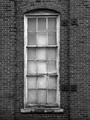
Urban Windowby JelloPhotogComment: i like it! personally I'd have shifted the window in the frame to the left a liiiittle more, but that's just me. a little extra contrast would be awesome as well, particularly darker blacks (the burn tool would be perfect, but you can't use that in basic editing. gr). one of the better images i've come across so far. well done.
P |
| Photographer found comment helpful. |
| 11/17/2004 12:23:52 PM |
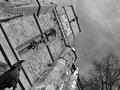
Grey timesby smr78Comment: i don't mind a picture being askew somewhat, but i'd say you've gone a little overboard for my tastes. that aside, it's a nice perspective on the building, and i like the inclusion of the clouds (not the trees so much, but what can ya do?) Too bad it's basic editing and you can't burn the clouds some....that contrast would be fabulous i think.
nice shot.
P |
| Photographer found comment helpful. |
Home -
Challenges -
Community -
League -
Photos -
Cameras -
Lenses -
Learn -
Help -
Terms of Use -
Privacy -
Top ^
DPChallenge, and website content and design, Copyright © 2001-2026 Challenging Technologies, LLC.
All digital photo copyrights belong to the photographers and may not be used without permission.
Current Server Time: 06/24/2026 12:43:28 PM EDT.