| Image |
Comment |
| 05/07/2003 11:20:48 AM |
|
| 05/07/2003 11:19:36 AM |
568mlby deceptiveComment: aptly titled. I might not have left the water droplets on it (or put MORE on it I guess), but that's just me. |
 Photographer found comment helpful. Photographer found comment helpful. |
| 05/07/2003 11:18:44 AM |
One Too Manyby TiNComment: that better not be REAL alcohol. booze crimes are not ok. :) nice shot. |
| 05/07/2003 11:02:25 AM |
Simple.by GeocideComment: too bad about the shadows...I really like the image. better lighting would lessen the need to brighten this and delineate your subject better. good job. |
| Photographer found comment helpful. |
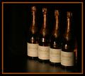
| 05/07/2003 11:00:26 AM |
Four Amber Decantersby ChaszmyrComment: I see some noise in the backfround on the left...can't tell if it's really there or just the 'puter. Too bad the labellers screwed up on the third bottle. nice setup either way. |
| 05/07/2003 10:58:12 AM |
Unitedby MusicmanComment: I'd like a more contrasty backdrop to set the glasses apart. A little soft on the focus, and a few hot spots on the right glass. nice idea though. |
| Photographer found comment helpful. |
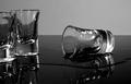
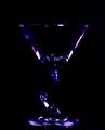
| 05/07/2003 10:56:43 AM |
Shaken Not Stirredby frd91gtComment: I've seen this glass before...:) Is that black like or photoshop? methinks photoshop due to the blue pixels in the black backdrop...but I can't be sure. great color choice either way. |
| Photographer found comment helpful. |
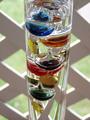
| 05/07/2003 10:55:04 AM |
Floating Glass Ballsby ReneeComment: I think either a shorter or longer lens would have worked better for me here...I like creative use of depth, but this one either doesn't blur enough, or blurs too much for my taste. I like it to be REALLY clear what you're trying to do. Nice subject and positioning though. |
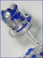
| 05/07/2003 10:53:07 AM |
Glass Fountain Penby jitamsComment: it looks like you messed with your reds and yellows too much. the nib shows up with red and yellow pixels that I THINK aren't really there. I like the pic though...cool subject. |
| 05/07/2003 10:50:52 AM |
Full Glassby justineComment: I think you oversaturated your blues (Cyans maybe). they show up a little pixely (but I DO like the color). Nice composition. |
| Photographer found comment helpful. |
Home -
Challenges -
Community -
League -
Photos -
Cameras -
Lenses -
Learn -
Help -
Terms of Use -
Privacy -
Top ^
DPChallenge, and website content and design, Copyright © 2001-2026 Challenging Technologies, LLC.
All digital photo copyrights belong to the photographers and may not be used without permission.
Current Server Time: 06/21/2026 04:46:27 PM EDT.