| Image |
Comment |
| 05/08/2003 04:53:27 PM |
a dip in acapulco bayby brentpaughComment: not sure about the angle you chose. I don't love borders on pictures...I usually find them a bit distracting, and this is no exception. with the angles in the photo and the angles in the border, I find myself wanteing to tilt my head. (in fact...I'm tilting it right now as I type). I don't know how else to do it, but that's my initial impression. It's refreshing though, especially after 260 pics or so. good idea. Pedro |
 Photographer found comment helpful. Photographer found comment helpful. |
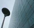
| 05/08/2003 04:50:35 PM |
The Urbisby PaulkComment: the post adds a nice bit of character to this. I took about a thousand building shots and didn't get one I liked. nice job. |
| Photographer found comment helpful. |
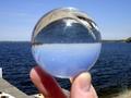
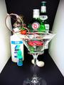
| 05/08/2003 04:49:13 PM |
Crystal Ballby PhoyoComment: hard to know where to focus on these shots. using a short lens (or wide angle) would help. it just looks a little soft to me. I like how ou tried to match up the horizons. good shot. |
| 05/08/2003 04:45:03 PM |
Head Above Waterby gerardComment: fantastic clarity...impressive for under 150kb. a couple of hot spots from the overhead lighting, but not too bad. I like it |
| Photographer found comment helpful. |
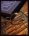
| 05/08/2003 04:41:26 PM |
The Professorby jmsetzlerComment: I don't usually like borders, but you did this one very well. Unlike a thread I just read, my opinion is that you CAN ruin a nice pic with a bad border. The only thing I'd change about this (and this is reeeeeally being nit-picky) is the crop at the top. My personal taste would have left either more or less of the title of the book showing. The box around the title disappears off-angle, and then shows up again in corner, and throws the balance off a bit. I like the lighting and shadows..even the flare on the glasses; which technically we're supposed to avoid, aren't we? :) very nice composition, John...er..whoever you are. (nice that the authors kept the press plates from their book...was that Dad and Grandpa who wrote that?) |
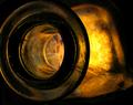
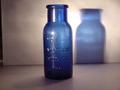
| 05/08/2003 04:25:23 PM |
'Sljivovica' Bottleby gaja_tzComment: really like the lighting on this. you achieved where many others failed in this challenge I think. good job |
| Photographer found comment helpful. |
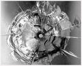
| 05/08/2003 04:23:47 PM |
Ouchby rickhd13Comment: I like that. not the crack...I hate those. but i like your picture. nice tight crop, and the BW works. |
| Photographer found comment helpful. |
| 05/08/2003 04:22:50 PM |
|
| 05/08/2003 04:11:34 PM |
|
| Photographer found comment helpful. |
| 05/08/2003 04:11:00 PM |
Blue shadowby johnphawkinsComment: the lighting is a little flat for my taste, but I like it. It's no blue glass head, mind you, but the idea is the same. |
Home -
Challenges -
Community -
League -
Photos -
Cameras -
Lenses -
Learn -
Help -
Terms of Use -
Privacy -
Top ^
DPChallenge, and website content and design, Copyright © 2001-2026 Challenging Technologies, LLC.
All digital photo copyrights belong to the photographers and may not be used without permission.
Current Server Time: 06/21/2026 06:20:51 PM EDT.