| Author | Thread |
Comments Made During the Challenge  |
|
|
05/13/2003 03:13:16 PM |
|
|
|
05/12/2003 01:57:11 PM |
|
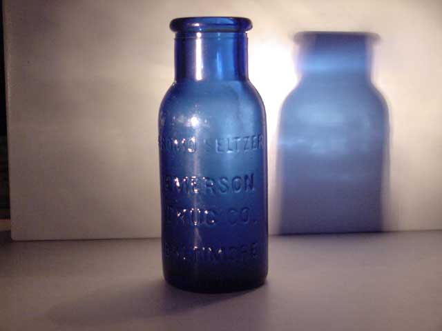
I can see that on the left, can't you? |
|
|
|
05/11/2003 11:52:57 PM |
|
Too many shadows, need a little tighter crop and a little sharpening on the image, preferably in the camera. The light could've been a little more intense too and I think you would've been in much better shape. |
|
|
|
05/09/2003 05:42:41 PM |
|
I like how the shadow is blue. It's a pretty good start but the composition is a little off. One thing you could do to improve your photo is crop it and straighten it. Bromo Seltzer - great choice. :) |
|
|
|
05/09/2003 08:45:46 AM |
|
Wonderful photograph. I think I'd even like it better if the edge of the screen on the left were cropped off. |
|
|
|
05/08/2003 04:11:00 PM |
|
the lighting is a little flat for my taste, but I like it. It's no blue glass head, mind you, but the idea is the same. |
|
|
|
05/08/2003 10:27:43 AM |
|
this need tighter cropping and straightening, maybe could be a little sharper.... good effort though, I like the shadow in the background... good luck, Todd. |
|
|
|
05/07/2003 11:32:50 PM |
|
|
|
05/07/2003 01:18:05 PM |
|
I'd consider cropping out elements unnecessary for overall content. Focus is 'quite' soft. A lil more sharpening may benefit this shot, too. |
|
|
|
05/07/2003 11:53:22 AM |
|
Is there a reason why you didn't crop black on left edge? |
|
|
|
05/07/2003 06:26:00 AM |
|
Good idea. Maybe it would be better to crop a little out on the left side, and maybe a different angle would be better. Like the non-aggressive colors. |
|
|
|
05/07/2003 12:33:48 AM |
|
Neat blue shadow, this needs a tighter crop though. Good idea! |
|
|
|
05/07/2003 12:25:58 AM |
|
The focus here seems a bit off, the lighting is a little on the dim side, the the cropping probably should have excluded the left side where you can see the end of the backdrop. Keep trying, This is a good start. |
|
Home -
Challenges -
Community -
League -
Photos -
Cameras -
Lenses -
Learn -
Help -
Terms of Use -
Privacy -
Top ^
DPChallenge, and website content and design, Copyright © 2001-2026 Challenging Technologies, LLC.
All digital photo copyrights belong to the photographers and may not be used without permission.
Current Server Time: 06/30/2026 12:11:22 AM EDT.