| Image |
Comment |
| 06/17/2003 02:05:13 AM |
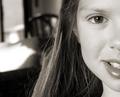
Taylor, Home at Homeby PaigeComment: Wow. can't tell you what I like about this, but...wow. Taylor is an absolute angel, and you've captured her beautifully. the DOF is perfect, the reflection on her eye, lips and hair bring this photo to life. this is my fav of the week so far. well done. PLEASE - print this huge and hang it in your office or den. fabulous. 9.
ps are all dads this sappy? |
 Photographer found comment helpful. Photographer found comment helpful. |
| 06/17/2003 02:02:26 AM |
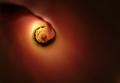
Matrioshkaby ChiquiComment: technically it seems fine, but doesn't really grab me in any way. there's nothing wrong with it...I just can't find what's right either. Maybe the yellow background is too overpowering? not sure. your lighting is the strength in this image. |
| 06/17/2003 02:00:48 AM |
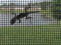
I'm Still Hereby togtogComment: I'd like to see more of this little guy. your gamma adjustment will lighten him up without blowing out the background too much. wonder how he lost his tail? :) |
| Photographer found comment helpful. |
| 06/17/2003 01:59:45 AM |
Singing....by TerryGeeComment: looks like you cheated your greens a bit. fantastic composition and sharpness though. 7 from me (above average :) ). Pedro |
| 06/17/2003 01:58:32 AM |
Self Centeredby tommy_tComment: a little more backlighting and not so much cropping under this guy's butt, and this is a solid 8. love the subject, and really like the negative space above. it's almost like the shot needs the space for his thoughts. |
| Photographer found comment helpful. |
| 06/17/2003 01:54:47 AM |
Sculptureby GraciousComment: i like the composition, but you overdid the red. the telltale signs of oversaturation (for future reference) are seen in the banding onthe roof onthe left, and the shadows beneath the structure. the flowers on the right are extraordinarily red as well. I wouldn't have desaturated the greens either...they'd have been nice for contrast. |
| Photographer found comment helpful. |
| 06/17/2003 01:52:19 AM |
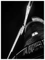
Windmill at Nightby BobsterLobsterComment: the perspective is a little disorienting at first. the blades of the windmill dominate the frame a bit too much for my taste. nice feel to the shot though...would also have worked for low-key challenge. :) |
| Photographer found comment helpful. |
| 06/16/2003 07:45:42 PM |
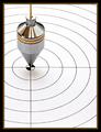
Self-Centeredby orussellComment: great subject. nicely cropped and framed (borders are growing on me). nothing wrong with a photo of a Plumb-bob. |
| Photographer found comment helpful. |
| 06/16/2003 07:44:20 PM |
|
| Photographer found comment helpful. |
| 06/16/2003 07:43:32 PM |
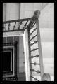
At the Wellby Firstrich1Comment: i love the composition, but would have preferred the focus be on the foreground rather than the floors below. either that or all in focus with a wider lens. the blur is a bit distracting. -Pedro |
| Photographer found comment helpful. |
Home -
Challenges -
Community -
League -
Photos -
Cameras -
Lenses -
Learn -
Help -
Terms of Use -
Privacy -
Top ^
DPChallenge, and website content and design, Copyright © 2001-2026 Challenging Technologies, LLC.
All digital photo copyrights belong to the photographers and may not be used without permission.
Current Server Time: 06/22/2026 03:48:52 AM EDT.