| Image |
Comment |
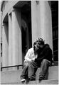
| 06/25/2003 07:46:16 PM |
lovers on the stepsby friscaComment: not bad for a vancouver lawyer. I'm kidding. love this shot. Your comments make sense to me, even if I don't agree with them all. Glad you're here.
Pedro from Calgary |
 Photographer found comment helpful. Photographer found comment helpful. |
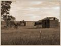
| 06/25/2003 10:04:46 AM |
Once Upon A Timeby BigHusker001Comment: don't think the fence adds anything. it drws my eye away from the fabulous barn. can't decide on the trees on the left - certainly doens't hurt the composition. good choice of sepia tone. |
| Photographer found comment helpful. |
| 06/25/2003 09:53:19 AM |
|
| Photographer found comment helpful. |
| 06/25/2003 09:52:29 AM |
Misty Morning Lakeby jasleeComment: nice effect.I might have cropped this a little tighter at the top to remove some or all of the blue. try it later...I'd like to see the result. I think it will add to the mystery of it. the lue seems to change the mood. really like the silhouette of the trees up front. |
| 06/25/2003 09:50:45 AM |
Country Brideby pncowleyComment: The greens look a little over-done on this...can't tell if that's the lighting, or if you slid your hues post-processing. I think it may be the lighting, as it looks a little flat. Nice backdrop...hope the clouds aren't a bad omen :) |
| Photographer found comment helpful. |
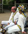
| 06/25/2003 09:48:51 AM |
Waiting for the dance to beginby Geo_GriffinComment: great colour. would like a different perspective and or different crop (tighter OR wider - doesn't matter). the composition leaves me asking questions - what are they looking at? what are they doing? what's with the funny things on their legs? :) Has a nice feel to it. you make me like these guys. |
| Photographer found comment helpful. |
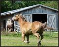
| 06/25/2003 09:46:38 AM |
Fence Lineby barahooComment: great use of the frame and depth of focus. lighting looks flat (did you drop the contrast?). as an aside - the image is very small...try re-sizing your long-side to exactly 640 pixels next time. that's the largest you're allowed. |
| Photographer found comment helpful. |
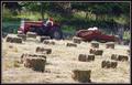
| 06/25/2003 09:43:52 AM |
First Cutting, 2003by karmatComment: might have rotated this just a wee bit counter clockwise. I understand he may be on a hill, but it leaves the pic off-balance for me. like the composition and the colours in this. |
| Photographer found comment helpful. |
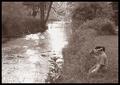
| 06/25/2003 09:42:29 AM |
At Water's Edgeby GekkerComment: little soft in focus, and overexposed in the reflections on the water. it's a tough balance without the ability to dodge and burn. try using the gamma correction on the original, and maybe decrease the contrast a bit. As it stands the flare draws away from the kids (who are doing a great job of posing by the way. nice shot.
I like borders now, but I wouldn't use black with sepia - too overpowering. |
| 06/25/2003 09:39:23 AM |
A quiet lifeby marboComment: The cloud shadows are interestng - I'l have liked it if you could get the clouds in the shot as well (not sure if it was possible - not a criticism, just a thought). I like how all the lines flow to the centre, so for that reason might have centred the house, or made it more off-centre. Being *just* off-centre makes the viewer wonder if it was intentional or not. |
| Photographer found comment helpful. |
Home -
Challenges -
Community -
League -
Photos -
Cameras -
Lenses -
Learn -
Help -
Terms of Use -
Privacy -
Top ^
DPChallenge, and website content and design, Copyright © 2001-2026 Challenging Technologies, LLC.
All digital photo copyrights belong to the photographers and may not be used without permission.
Current Server Time: 06/22/2026 12:06:41 AM EDT.