| Image |
Comment |
| 10/29/2003 12:25:54 AM |
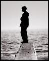
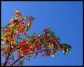
Daydreams from the edgeby ChezComment: that's magic Chez - I didn't see it until after the challenge, but clearly one of my favourites. DPCPrints? :)
Pedro |
 Photographer found comment helpful. Photographer found comment helpful. |
| 10/21/2003 03:11:17 PM |
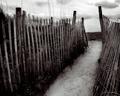
By the Seaby AleciaComment: this looks really familiar to me...i can't think why, but it feels like I've been there. I love it. Maybe one of my favourite pictures of all time. thanks for taking it.
P |
| Photographer found comment helpful. |
| 10/13/2003 01:56:16 AM |
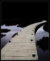
Anxiety by jjbeguinComment: I had this as my favourite from the beginning JJ - thanks for taking it.
Pedro Message edited by author 2003-10-13 02:41:53. |
| 09/22/2003 12:24:33 AM |
|
| 09/20/2003 12:51:59 AM |
Sweet or sourby pitsamanComment: this looks a little soft, and i think it's because the colour saturation has been pushed a bit too much. that could either be photoshop or your camera. running an unsharp mask filter would help this. once before you resize it, and again after. |
| Photographer found comment helpful. |
| 09/20/2003 12:35:47 AM |
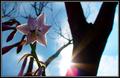
A Time to Live, a Time to Dieby karmatComment: i think a fill-flash would have done wonders for this. it would illuminate the flower without losing the silhouetting on the trees in the background. really like the setup though.
Pedro |
| Photographer found comment helpful. |
| 09/20/2003 12:27:25 AM |
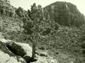
Escapeby unclea76Comment: gotta be Arizona or Utah, which means it started out a brilliant red/orange - which makes me wonder why the olive duotone. the choice of colour flattens the contrast a bit, and i think that detracts from the compositional contrast between the tree and the rock. I shot one almost identical to this last week at Tonto NM :). I'd like to see it in colour as well.
Pedro |
| 09/20/2003 12:21:56 AM |
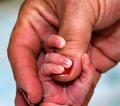
New life....Frankie my sonby balzakComment: what an angel. love the look on his face. the background draws away from him i think. something solid would put the attention back on him. congratulations by the way :)
Pedro |
| 09/20/2003 12:04:11 AM |
Newby Firstrich1Comment: I didn't vote on this challenge, but I did look at all the pictures, and this is hands down (pardon the pun) the best of the lot. Compositionally I think you nailed it - nice crop, great lines, nice DOF. I think technically it could be improved a little - diffused light would eliminate the hot spots of the baby's fingernails, and the reds seem a little overdone, accounting for some of the grain. Really all it needed was better lighting, but giventhe subject I can see how that might be difficult. I'd give it a 9, and I don't give many of those. |
| Photographer found comment helpful. |
| 09/01/2003 11:50:49 AM |
monument to freedom by magnetic9999Comment: MAG,MAG,MAG,MAG,MAG,MAG,MAG,MAG,MAG,MAG,MAG! You rock, Bro - nice pic.
Pedro |
| Photographer found comment helpful. |
Home -
Challenges -
Community -
League -
Photos -
Cameras -
Lenses -
Learn -
Help -
Terms of Use -
Privacy -
Top ^
DPChallenge, and website content and design, Copyright © 2001-2026 Challenging Technologies, LLC.
All digital photo copyrights belong to the photographers and may not be used without permission.
Current Server Time: 06/23/2026 12:48:00 AM EDT.