| Image |
Comment |
| 06/20/2022 07:27:40 PM |
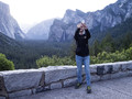
Tourist Selfiesby MelethiaComment: How can such a beautiful scene be a trivial pursuit... Interesting but kind of a snapshot. |
 Photographer found comment helpful. Photographer found comment helpful. |
| 06/20/2022 07:26:42 PM |
|
| Photographer found comment helpful. |
| 06/20/2022 07:24:52 PM |
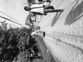
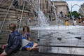
idle hoursby mariucaComment: Seems to me that the artwork at the Met isn't really trivial... Nice try... I've never been able to capture kids amid that fountain very effectively either |
| Photographer found comment helpful. |
| 06/20/2022 07:22:49 PM |
500th Volunteer Dive by vawendyComment: Seems to me it doesn't really meet the challenge... not trivial enough. Still a wonderful capture; love the colors |
| Photographer found comment helpful. |
| 06/20/2022 07:21:39 PM |
|
| Photographer found comment helpful. |
| 06/20/2022 07:21:17 PM |
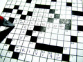
Cruciverbalismby GeneralEComment: Clever use of crucigramism. Love how the red on the pencil breaks the black and white mold |
| Photographer found comment helpful. |
| 06/20/2022 07:20:04 PM |
Avoid Tennesse Avenueby LydiaComment: Finally a trivial pursuit that is almost as trivial as TRIVIAL PURSUIT. Love the composition and the gold pieces. |
| Photographer found comment helpful. |
| 06/20/2022 03:47:07 PM |
|
| Photographer found comment helpful. |
| 06/20/2022 03:46:20 PM |
|
| Photographer found comment helpful. |
| 06/20/2022 03:45:45 PM |
|
Home -
Challenges -
Community -
League -
Photos -
Cameras -
Lenses -
Learn -
Help -
Terms of Use -
Privacy -
Top ^
DPChallenge, and website content and design, Copyright © 2001-2026 Challenging Technologies, LLC.
All digital photo copyrights belong to the photographers and may not be used without permission.
Current Server Time: 07/16/2026 10:08:33 PM EDT.