| Image |
Comment |
| 09/26/2004 04:50:04 PM |
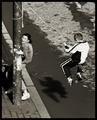
Knock Out by labudsComment: My pick for third place. I can't wait to find out how this was achieved. Awesome work. 10 |
| 09/26/2004 04:49:09 PM |
|
 Photographer found comment helpful. Photographer found comment helpful. |
| 09/26/2004 04:48:43 PM |
|
| Photographer found comment helpful. |
| 09/21/2004 12:50:53 PM |
1962.jpgby garlicComment: Oh, now we're talkin. This rocks! Going in my favorites. |
| Photographer found comment helpful. |
| 09/21/2004 12:50:11 PM |
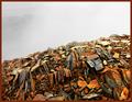
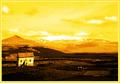
4308.jpgby garlicComment: I like this crop and some of what you have done with the colors on this version of the photo but I don't like the tilt to the house and it seems like you've lost a bit of detail. I'd work some more on this photo. I see tons of potential in both the original shot and in your post processing ideas. |
| Photographer found comment helpful. |
| 09/21/2004 12:41:14 PM |
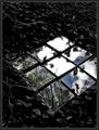
Skylight by jjbeguinComment: This was one of my favorites in the challenge. The funny this is that I almost did something very very similar. I bought a pack of those square mirrors at home depot with something like this in mind but the package only contained 6 of them and I eventually concluded that I needed 9 only I was too lazy and poor to go back to the store for another pack.
Certainly this is much better than any of my attempts came out or would have come out even if I had purchased more mirrors. It is, after all, about how good a photographer and visionary one is, not one's quantity of mirrors.
Congrats on the blue! |
| Photographer found comment helpful. |
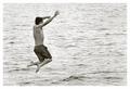
| 09/20/2004 12:37:39 AM |
On a Hot Summer Dayby tyt2000Comment: I really like the simplicity of the composition as well as the tone in this image. You managed to make the water look how I like it to look (something I can never do). It's great to see something with emotion and life in this challenge. Makes me feel like taking a plunge myself. 10 |
| Photographer found comment helpful. |
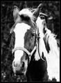
| 09/18/2004 06:37:47 PM |
Old Horseby Ecce_SignumComment: I don't think it's the grain/noise that is the main problem although there is a little too much of it. I get the feeling that the original image itself was a bit less that nicely sharp so you tried to cover that up by making it black and white and adding noise. I do that a lot too but find it rarely works. The best grainy vintage looking black and whites usually come from sharp clean color images. :)
I still like this image though. It looks better from farther away. |
| Photographer found comment helpful. |
| 09/15/2004 03:58:34 PM |
|
| Photographer found comment helpful. |
| 09/15/2004 03:39:43 PM |
|
| Photographer found comment helpful. |
Home -
Challenges -
Community -
League -
Photos -
Cameras -
Lenses -
Learn -
Help -
Terms of Use -
Privacy -
Top ^
DPChallenge, and website content and design, Copyright © 2001-2026 Challenging Technologies, LLC.
All digital photo copyrights belong to the photographers and may not be used without permission.
Current Server Time: 05/09/2026 01:13:41 PM EDT.