| Image |
Comment |
| 08/07/2007 01:05:20 AM |
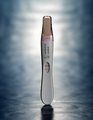
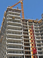
The Ultimate Successby LoreneComment: This looks like it could be an advertisement. Lighting is very good and your color is spot on. |
 Photographer found comment helpful. Photographer found comment helpful. |
| 08/07/2007 01:04:40 AM |
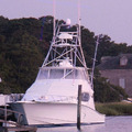
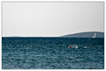
2nd homes with a boatby whiterookComment: Mmmm, I'm not really a fan of pink boats. (Levels and/or curves.) I think a different perspective on this shot would add a little more interest. |
| Photographer found comment helpful. |
| 08/07/2007 01:03:19 AM |
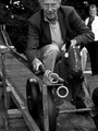
Winningby theeComment: Nice idea for composition. Quite interesting. The subject needs to be a little brighter and could use just a bit more contrast (IMO). Great timing. |
| Photographer found comment helpful. |
| 08/07/2007 01:02:24 AM |
life cycleby shaundpComment: I love this in b&w. Your detail is nice and your tonal range is good. i like the way this draws your eye at an angle. |
| Photographer found comment helpful. |
| 08/07/2007 01:01:33 AM |
My First Step!by veggieComment: I love the composition here. It's a clean, simple shot with nice detail. Gotta love the red shoes! Maybe a bump to the contrast and brightness? |
| Photographer found comment helpful. |
| 08/07/2007 01:00:32 AM |
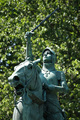
Joan of Arcby geoffbComment: Not the most interesting to me. Perhaps a stronger bokeh so the leaves wouldn't distract as much. I little earlier or later in the day would produce stronger shadows and a little less harsh lighting. This would make the colors a bit more contrasting and add more interest(IMO). ;) |
| Photographer found comment helpful. |
| 08/07/2007 12:57:59 AM |
|
| Photographer found comment helpful. |
| 08/07/2007 12:57:34 AM |
Willby gocComment: Interesting colors. I might have cropped out more of the sky to accentuate the swimmer a bit more. Make the horizon more on the rule of thirds. I like the border. Looks like a rough day to swim!! |
| Photographer found comment helpful. |
| 08/07/2007 12:56:06 AM |
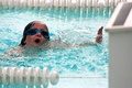
Reachin' for the Wall....by annigComment: Very interesting shot. I like the "framing" from the lane markers. Your detail is nice and your lighting is good. I might have cropped just a bit tighter on the right wide as the blurry thing is a little distracting to me. Don't remove completely, just diminish it's presence in the shot. |
| Photographer found comment helpful. |
| 08/07/2007 12:54:27 AM |
|
Home -
Challenges -
Community -
League -
Photos -
Cameras -
Lenses -
Learn -
Help -
Terms of Use -
Privacy -
Top ^
DPChallenge, and website content and design, Copyright © 2001-2026 Challenging Technologies, LLC.
All digital photo copyrights belong to the photographers and may not be used without permission.
Current Server Time: 07/25/2026 05:18:37 PM EDT.