| Image |
Comment |
| 12/19/2008 10:49:45 PM |
|
 Photographer found comment helpful. Photographer found comment helpful. |
| 12/19/2008 02:55:22 PM |
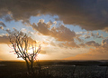
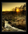
Sad sunsetby Rino63Comment: Greetings from the Critique Club
I think is is an image that did not score as well as it could have done. I think the composition is very nice, the tree on the left is well placed and gives an anchor point. The sun is pretty bright so rather difficult to expose correctly. I am not entirely sure a scene such as this really benefits from the Lucis Arts filter. I think possibly the effect this filter has had on the sky makes it look a little unreal.
I do think a slightly different approach to editing this would have given you a slightly higher score. I would tried a levels adjustment layer on the dark foreground only, reduced the brightness/exposure very slightly on the sky and then pumped up the vibrancy/saturation a little bit in the blue/cyan/red channels. I think that would have made a big difference and may have helped the score slightly.
I do think this image had the potential to score much better.
Sarah |
| Photographer found comment helpful. |
| 12/19/2008 07:30:57 AM |
Outtake 2by JimiRoseComment: Hi, I just left you a critique on your challenge entry. I have to say, I think this one may have been a better choice for the challenge, but only if you had pumped up the saturation a little bit. I was thinking more of the vibrance in ACR actually than the saturation. It wouldn't need much, just a tweak. This is really a nice one. |
| Photographer found comment helpful. |
| 12/19/2008 07:21:55 AM |
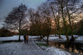
A Lonely Wanderer by the Frozen Lakeby JimiRoseComment: Greetings from the Critique Club
I rather liked this during voting (gave it a 6) and was surprised it didn't score a little higher.
I think the commenters have pretty much nailed most of the reasons why it didn't score higher. There is possibly too much reliance on the title, as the elderly man is really rather lost in this. The composition is good the way it is, but in order to emphasise the subject (as your title has made the man the subject), it would probably have been better to crop a little tighter. The tracks on the ice are great, but I am inclined to agree with  tnun tnun about cropping out the stones.
I think I would also probably suggest a slight levels adjustment to lighten the midtones. You could get a bit more detail out of the trees which I think would have helped. Also, as this was a sunset/sunrise challenge, I wonder if a slight boost to the red/yellow saturation would have helped your score. It's such a lovely wintery scene, I just don't think it has reached it's potential. It may be a tad too sharp as well.
Hope this was helfpul. Give it a go with a slight crop and levels adjustment. I'd be interested to see how it came out.
Sarah |
| Photographer found comment helpful. |
| 12/19/2008 06:59:58 AM |
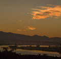
Backdrop for a wine farmby CarlvanHeerdenComment: Greetings from the Critique Club
I think the sunset must have been amazing - would love to have seen it myself.
As far as the composition goes, I think this would have been much better in a horizontal orientation. The mountain to the right is cropped right through the middle and my eye is drawn immediately to that. You've done a great job with Photomatix as you have managed not to increase the noise levels too much (always hard with low contrast scenes) and have avoided the "cartoon" look. The reds are amazing - not sure how pumped they were in editing, but either way I feel like I can imagine the sunset.
A couple of other reasons you may have scored a bit lower than perhaps you would have hoped: in a sunset/sunrise challenge some people may actually be looking to see the sun itself in the frame. Also, in a challenge with such strong competition I think this probably lacks the WOW factor, but largely, I think the main reason is the orientation of the photo.
Hope some of this was helpful.
Sarah
|
| Photographer found comment helpful. |
| 12/19/2008 06:48:25 AM |
Winter... stage leftby Pipe_DreamComment: Greetings from the Critique Club
I was surprised to see this scored only a 5.1, I think it probably was worth a higher score than that. I have read the comments left during voting and can see that people did not like the artificial lighting you used. When viewing this again, after the challenge, I am inclined to agree with those comments. I actually gave you a six, as I did really like the composition. However, I do agree the person in the shot looks somewhat isolated due to the lighting.
The composition is strong, but the focus looks a little soft. The trees and hill in the background look quite soft. I have to agree with Aliqui's comment about the vignette. I do not think this was probably necessary for this particular photo. I think it detracts from the overall composition.
The colour in the sky looks a little bit unnatural and I think this may have hurt you a bit.
Overall I think this is a nice sunset photo, but given the challenge it was in, certainly does not have anywhere near enough WOW to woo the DPC voters.
Sarah |
| Photographer found comment helpful. |
| 12/19/2008 05:59:04 AM |
Early glow over the ridgeby jnenvirComment: Greetings from the Critigue Club
I'm sorry this didn't score better for you, but I think there are a number of things contributing to the low score, mostly relating to the processing.
The composition itself is good and you captured the sky rather nicely. However, as the image has rather a lot of noise in it, which surprises me given the caliber of your equipment, it suggests that you have cropped this image rather heavily during post processing. The image itself does look a little as though it could be straightened, although that is possibly just an illusion due to the angle. The focus also looks a little soft, again, I wonder if that is a product of using a zoom/heavy cropping.
As this was an advanced editing challenge you could probably have cloned out the suspension wire that is visible. It think this may have helped, although, of course, it would be quite a big job.
I think most of your comments received should have given you some pointers on how to improve a shot like this for the future.
Sarah |
| Photographer found comment helpful. |
| 12/19/2008 04:34:22 AM |
Golden sunsetby sekarmalathyComment: Greetings from the Critique Club
First of all many congratulations on 6th place. Well deserved, this is a lovely image.
Well, it is, I must say, rather difficult to provide tips on how to improve this photo. Composition is excellent, technically I can't see much wrong with it. The colours are very subtle. The only thing I really am not that fond of is the heavy border. I am not suggesting a border is bad, but these feels just a little bit heavy for such a delicately coloured image. I think if you had a smaller border you may have even ribboned!
I did actually give this a 7 and probably would have given an 8 if the border was more subtle.
Sarah |
| Photographer found comment helpful. |
| 12/19/2008 04:28:41 AM |
05:45am sunriseby ytshuvaComment: Greetings from the Critique Club
I think the score you received is probably around about right for this shot. This is indeed a beautiful sunrise, however, there are a number of things that could have improved the score quite easily.
The extreme shadows in the foreground do actually hurt this one a little bit. If the foreground was slightly lighter the viewer would be able to put the excellent leading line more into context. Right now it looks a little out of place.
Composition: if you had perhaps taken a few steps to the right so the subject was more to the left of the frame you could have made better use of the leading line. Also, to my eye the horizon looks like it is right in the middle of the photo. I think including a little bit more of the sky may have helped this.
Overall a very nice sunrise photo that potentially could have scored a little higher with some additional editing.
Sarah |
| Photographer found comment helpful. |
| 12/17/2008 02:43:02 PM |
|
| Photographer found comment helpful. |
Home -
Challenges -
Community -
League -
Photos -
Cameras -
Lenses -
Learn -
Help -
Terms of Use -
Privacy -
Top ^
DPChallenge, and website content and design, Copyright © 2001-2026 Challenging Technologies, LLC.
All digital photo copyrights belong to the photographers and may not be used without permission.
Current Server Time: 05/06/2026 09:43:23 PM EDT.