|
|
|
Showing 4611 - 4620 of ~6577 |
| Image |
Comment |
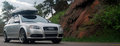
| 06/07/2009 04:07:35 PM | Audi: Coloradoby SoulComment: Greetings from the Critique Club
Looking at the comments below, I see that you have not marked some as helpful. That is very interesting because instead of the normal one or two words, at least two of those comments are extremely helpful as they are explaining to you why you like only scored a 5.00. I am likely to repeat most of what they said in my critique.
The composition is good, you have the car driving into the frame which works well. The choice to use a sort of letterbox crop is interesting and I'm not 100% sure that this works that well. I think I would prefer to see a little more vertical height above the roof of the car.
The focus seems a bit off, the rocks to the right of the frame are sharp but the car is not that sharp (it doesn't really look like motion blur). Also, the image feels a bit flat with regard to the lighting. A boost in levels would likely have helped a bit here, as it seems a bit underexposed.
As this was an advanced editing challenge, you could have selected the car and adjusted the levels (midtones) specifically for the car and then inverted the selection and boosted the rest of the image (highlights). I feel sure this would have helped.
As this was a automobile ad, I think you would have really helped your score by adding some text/graphics to the image. Most of the higher scoring images had texts added.
I was surprised this didn't score higher. It is a good image that could benefit from a bit more advanced editing. Hopefully you understand a bit better now why it only scored a 5.00.
|
| 06/07/2009 03:44:04 PM | Stand Out!by witt34Comment: Greetings from the Critique Club
I read your photographers notes and noted that you did not shoot this specifically for this challenge. It is a pity that you had not taken the shot just a couple of seconds sooner, so that the car is entering the frame rather than leaving it. This would have given you more space to the left to add your text. The car would also not have been competing as much with the background.
The background is a bit distracting and I do believe it cost you a few points. I notice you are in South Korea, so it is probably not unusual to see the text as written over to the right. Again, I think this probably cost you a few points in the scoring, even though some of your commenters liked it that way.
|  Photographer found comment helpful. Photographer found comment helpful. |
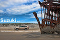
| 06/07/2009 03:07:02 PM | Suzuki XL7by aliquiComment: Greetings from the Critique Club
Congrats on the 6+ score and 20th place.
It was interesting just now reading through the comments, I was amazed how many people didn't get the tagline. I thought it was self evident, but there ya go!
Composition in this image is very strong, although perhaps the shipwreck does over power the car a little. I know it was luck that you managed to get this shot and that it was not a set up, so the car colour was not optional, but that said, I do think a stronger coloured car would have helped. As this was an advanced challenge, I wonder if you could have switched the colour of the car for something else? Just a thought and probably a silly one at that.
It's interesting to watch how the trends come and go on DPC. Currently Topaz Adjust is all the rage and I can see you have used it here. I think used with a bit of discretion this tool can really enhance the processing of some images, but to be perfectly honest, I think it is a little bit too heavy in this image and it has spoilt the quality of the image a bit. I may be the only one thinking like this however, as you did indeed get a decent score.
Like I said, good strong composition, that was hurt a little for me, by a bit of heavy processing.
| | Photographer found comment helpful. |
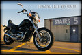
| 06/07/2009 02:47:31 PM | 1985 HONDA SHADOW VT500Cby tryals15Comment: Greetings from the Critique Club
I think you know immediately why this only scored 5.47. If you wanted to get a higher score, then you should not have entered a bike in an automobile ad. Langdon's description even mentions cars, so honestly, you took a risk and you probably knew it ahead of time.
That said, I think the image itself is great. The composition is excellent. The sky, however, feels a little over exposed, always challenging in such bright sunshine not to do that. The bike itself could benefit from being a little bit lighter, but again, not a biggy. The graphics also work, although I perhaps would have left off the border. I think there is a conflict between the cleanness of the advertising graphic and the grunginess of the border, so I think I'd do without the border.
Overall I think this was very well done, but I'm not surprised it didn't do better. In a different challenge I expect it would have been around 5.8 - 6.00.
| | Photographer found comment helpful. |
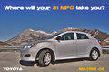
| 06/07/2009 02:28:54 PM | 2009 Toyota Matrixby CitadelComment: Greetings from the Critique Club
Conceptually a good car ad, composition is good, the graphics are good although not particularly sharp (don't know how to overcome that), but I believe what is letting you down is the post processing from the HDR image.
One of the problems I have experienced when using photomatix, is that the tonemapped image loses something along the way. Getting the tonemapping just right is I think very difficult. The car in your image has that weird very flat grey look often found in tonemapped images. There is a sort of halo effect around both the car and the mountains, which although only quite feint is there nonetheless. The image lacks contrast especially on the car. This is one of those cases I think where the HDR has not really improved the image.
Apart from the tonemapping problem, I think this was a well executed shot that met the challenge well. | | Photographer found comment helpful. |
| 06/07/2009 11:36:17 AM | | | Photographer found comment helpful. |
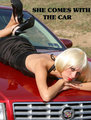
| 06/07/2009 11:14:01 AM | Hood Ornamentby JoaniePComment: Greetings from the Critique Club.
Sorry you did not score higher with this image, I thought it was a fun entry.
This is sort of reminiscent of the 1970's style car shows, where beautiful women would be draped all over the cars on the stands.
I think the font also has a very 1970's feel to it, which may very well have cost you a few points as far as DPC is concerned. The car feels as though it is framed a bit too tightly. I would really like to see a little bit more of the car itself. Somebody else commented about the badge of the Cadillac being cut off, this likely cost you a few points. I have come to realise over the years on DPC, it is these really small details that typically make the difference between a lowish/average score and a higher score.
Well done though, for even though it didn't score so well, I think it was a very well conceived idea.
|
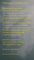
| 06/07/2009 10:55:21 AM | Reflections in a Rainy Civicby posthumousComment: Sorry Posthumous, you got me, so not sure I will be too helpful with the old poetry critique!
You know this was destined for a low score and kudos for you for doing this anyway. I do appreciate your talent, but do not have the verbal skills to express that appreciation. Unlike you, I am no wordsmith. | | Photographer found comment helpful. |
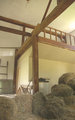
| 06/07/2009 10:18:10 AM | Trying to convert a hayloft into a loft apartment...by snafflesComment: Greetings from the Critique Club
This is starting to get weird now! I'm wondering if anybody else is ever going to crop in my queue. I think this is my 6 critique for you in the last few weeks.
I wrote a big long critique and then my machine got stuck and I needed to reboot, so just lost it all.
I am going to start this critique by asking you, a fellow critique club member, how you would critique this image?
I have a couple of questions about it. When you entered this into the I Quit challenge, did you really think it actually met the challenge, or did you think that you could squeeze it in with the title? (I'm assuming you did think it met the challenge or your would not have entered it) Do you yourself like it? What score would you give it in light of the challenge topic?
I ask the questions, just as a pre-amble to my critique, because my words may sound harsh, but I think if you put this up for critique, then you want real feedback and not just platitudes.
Technically this image is lacking. The exposure is off, it lacks contrast and the colours are washed out. Some of these things could have been fixed in camera by using the correct exposure, but a lot could be done in post processing since the highlights and shadows are not clipped. I'd be very interested to see the original file, as you have listed a whole bunch of editing steps, but I am not sure what those have done to this one. It may have been a good idea to boost the ISO to 400, it may have given you a faster shutter speed which in turn may have made the image a bit sharper. Even with VR 1/30 is quite a slow shutter speed and could easily give you a bit of camera shake. Typically anything lower than 1/60 is going to cause some kind of camera shake.
Coming back to the concept. I'm afraid to say I see this as a real shoe horn for this challenge. The image itself does not really portray quitting, it relies on the title to link it to the challenge topic. You were far from the only person to do that. I think this was a really difficult challenge, so kudos for giving it a go.
Susan, I'm sorry if this critique sounds harsh, it's not meant to be and I certainly do not want to discourage you. Having critiqued so many of your images just recently, I would just like to help you a little bit.
Sarah
| | Photographer found comment helpful. |
| 06/07/2009 04:33:13 AM | Lexus Manby snafflesComment: Greetings from the Critique Club
Well, me again!
Sorry this didn't tip the 5 scale. I think conceptually this was an almost there kind of shot. I think anybody who chose not to include text in this challenge was hurting with the score. As it was an advertising challenge, a much more graphic feel was needed to score well.
From a technical point of view, I think you are hurting a bit too. The image is quite over exposed, especially in the sky area. What would have helped you a lot in this specific case would be to use a circular polariser on your lens. So not a photoshop trick this time! The polariser would have helped make the blues bluer and yet keep the clouds fluffy and white.
That said, you could have also fixed it to some extent, very very easily in photoshop. The highlights in the clouds are just a bit too blown out to do much in PS.
Perhaps think about bracketing your shots to get the optimal exposure in the future. The histogram on your camera is your friend. Check it out, if the histogram is strongly to right, you have overexposed the highlights, or if it's strongly to the left, you have underexposed the shadows. In both cases, it's nearly impossible to get any detail back in post processing. If you set the camera to bracketing mode, where it takes one at what the camera thinks is the correct exposure and then the next 2 images will be a 1/3 of a stop (if that's what you have set the bracketing to) under exposed and a 1/3 stop over exposed. That way you get a more accurately exposed shot and less work to do in PS. Doing this can help as sometimes the camera doesn't get it right!
Concerning the composition, I think the angle of view could have been improved. As several people commented, this seems to be more about the man and less about the car. Moving him to the other side, would have been a good idea. Also, you do have a bit too much sky, which again takes away from the car.
As I said, though, the concept was good and some small changes to both the composition and exposure could have brought it up at least to the mid-fives (even without the fancy graphics and texts).
| | Photographer found comment helpful. |
|
Showing 4611 - 4620 of ~6577 |
Home -
Challenges -
Community -
League -
Photos -
Cameras -
Lenses -
Learn -
Help -
Terms of Use -
Privacy -
Top ^
DPChallenge, and website content and design, Copyright © 2001-2026 Challenging Technologies, LLC.
All digital photo copyrights belong to the photographers and may not be used without permission.
Current Server Time: 05/07/2026 08:52:33 PM EDT.
|