| Image |
Comment |
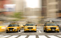
| 08/25/2009 06:18:50 AM |
Taxi Standby pawdrixComment: And ditto. How did you do this? It's a really interesting effect. |
 Photographer found comment helpful. Photographer found comment helpful. |
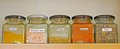
| 08/19/2009 11:48:04 PM |
herbsby achComment: not really an appliance. |
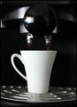
| 08/19/2009 11:45:43 PM |
Espressoby pacpintoComment: The idea is OK, but the image is out of focus and the highlights are blown out, or maybe that's how it looks before you have your first coffee of the day! |
| Photographer found comment helpful. |
| 08/19/2009 11:43:57 PM |
|
| Photographer found comment helpful. |
| 08/19/2009 11:43:31 PM |
|
| Photographer found comment helpful. |
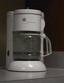
| 08/19/2009 11:41:26 PM |
12-Cup Coffee Makerby 777STANComment: Well, it's a household appliance that's for sure, but it lacks a bit in the creativity part of the challenge description. |
| Photographer found comment helpful. |
| 08/19/2009 11:37:27 PM |
Sew me..by chestomComment: This is a nice idea, but that border really takes away from the image itself. |
| Photographer found comment helpful. |
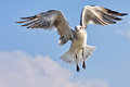
| 08/19/2009 01:06:31 AM |
"Jonathan Livingston Seagull" by Richard Bachby vawendyComment: Wendy, I didn't vote on this challenge. However, like VitaminB I probably would have only given it a 5.
From a compositional point of view, I find this to be framed too tightly. I would want to see more of the sky. In fact, to be honest, I think to portray JLS well, a soaring seagull, however boring, would have perhaps been a higher scoring choice.
Also, it looks like this has been heavily cropped and somehow that affects the image quality. Please bear in mind this is only my opinion, but it may explain some of the 3s and 4s. Don't know if this helps at all. |
| Photographer found comment helpful. |
| 08/15/2009 04:52:48 PM |
|
| Photographer found comment helpful. |
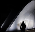
| 08/14/2009 09:24:44 AM |
The Pearly White Gateby RulerZigzagComment: Greetings from the Critique Club
Interesting image, I could imagine seeing it as a book jacket for a murder mystery book.
I like how even though it's a colour image, it looks like a black and white. The composition is good, I am a fan of negative space, although I perhaps would have liked the lone figure to be a bit further to the right, but that's a miniscule nit pick and simply my personal preference. I like the silhouetted figure with the strong backlighting, it's very effective. Also the complete darkness adds to the sense of mystery.
Tying to analyse why this did not score higher is difficult, I think it's a well composed interesting image, but I suppose it perhaps lacks the WOW factor that is typically associated with DPC free study challenges. I would have expected it to be more like 6.0.
|
| Photographer found comment helpful. |
Home -
Challenges -
Community -
League -
Photos -
Cameras -
Lenses -
Learn -
Help -
Terms of Use -
Privacy -
Top ^
DPChallenge, and website content and design, Copyright © 2001-2026 Challenging Technologies, LLC.
All digital photo copyrights belong to the photographers and may not be used without permission.
Current Server Time: 05/08/2026 04:21:14 PM EDT.