| Image |
Comment |
| 09/15/2009 05:43:59 PM |
eyes on the lineby delinComment: As with a lot of others in the challenge, the sky is what is stopping me bumping this to a 7 from a 6. I always find it so hard to get the sky right when doing HDR/tone mapping. |
 Photographer found comment helpful. Photographer found comment helpful. |
| 09/15/2009 05:42:46 PM |
Hawk Watch (3 shot HDR)by SteefComment: Not so sure about the sky in this one - there is haloing around the trees. Shame, it's otherwise a nice image (still it got a 6 from me) |
| Photographer found comment helpful. |
| 09/15/2009 05:38:32 PM |
Take Coverby JuliBocComment: I think the less is more approach works a bit better with the HDR tools. I like the composition of this image, but the processing really is a bit over the top. |
| Photographer found comment helpful. |
| 09/15/2009 05:27:29 PM |
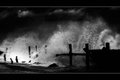
|
| Photographer found comment helpful. |
| 09/14/2009 08:52:15 AM |
Daybreak, Schoodic Peninsulaby Bear_MusicComment: Excellent processing, well done. Lovely. ETA: I re-read the comment and just wanted to say, I wasn't just scoring this based on the processing! |
| Photographer found comment helpful. |
| 09/14/2009 06:45:41 AM |
Eveningby GlanniComment: I really like this image, the composition, colours and even the use of topaz give it a very nice painterly feel, however, I do not think it really fits the bill when it comes to HDR. The details have not been enhanced here, rather hidden by using the topaz filter. Nice one for a Free Study, but not so much for HDR. |
| Photographer found comment helpful. |
| 09/10/2009 07:03:42 AM |
|
| 09/10/2009 03:23:14 AM |
Line Upby BugzeyeComment: I was away whilst this challenge was in voting, so this is the first time I have seen this image. I have to say, I am astonished that it scored so low, as I feel it's a pretty strong image. I haven't looked at any of the others in this challenge, but I would really have expected it to be up there in the 6.3-6.5 range. Would have got a 7 or 8 from me! So, sorry doesn't help explain the 2s and 3s but... |
| Photographer found comment helpful. |
| 09/08/2009 07:51:30 AM |
run!by Ecce_SignumComment: Ooh, look at you with your fancy score! And a LB shot to boot. Well done on the top 20. |
| Photographer found comment helpful. |
| 08/27/2009 02:43:41 AM |
|
| Photographer found comment helpful. |
Home -
Challenges -
Community -
League -
Photos -
Cameras -
Lenses -
Learn -
Help -
Terms of Use -
Privacy -
Top ^
DPChallenge, and website content and design, Copyright © 2001-2026 Challenging Technologies, LLC.
All digital photo copyrights belong to the photographers and may not be used without permission.
Current Server Time: 05/08/2026 05:21:30 PM EDT.