DPChallenge: A Digital Photography Contest You are not logged in. (log in or register
 
Browse Settings
Currently viewing:
Registered Usersalmiakki

Show comments:

Per page:

Order:

Comments:


Comments Made by salmiakki
Pages:   ... [432] [433] [434] [435] [436] [437] [438] ... [658]
Showing 4341 - 4350 of ~6575
Image Comment
09/20/2009 12:41:01 AM

by Mephisto

Comment:
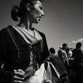
Markets are such a great place to hang around. This is really well done.
Photographer found comment helpful.
09/20/2009 12:39:41 AM

by Mephisto

Comment:
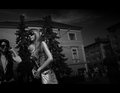
Christophe this is fab.
Photographer found comment helpful.
New and Old Architecture
09/19/2009 07:12:09 PM
New and Old Architecture
by ronaldfw

Comment:
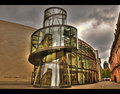
The HDR treatment on the buildings works really well, but sadly the sky and the haloing is not good.
Photographer found comment helpful.
The Tunnel
09/19/2009 07:11:30 PM
The Tunnel
by talmy

Comment:
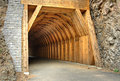
I think the processing is very nicely done here, lots of details brought out. Just the subject and composition are not terribly interesting.
Photographer found comment helpful.
Quiet moment
09/19/2009 07:11:05 PM
Quiet moment
by IreneM

Comment:
what a pity the horizon is tilted.
Photographer found comment helpful.
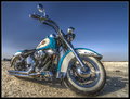
Heritage
09/19/2009 07:10:00 PM
Heritage
by gys

Comment:
You have done really well bringing out the details in the bike, but the sky let's this down.
Photographer found comment helpful.
Bonny Kay
09/19/2009 07:03:12 PM
Bonny Kay
by Bugzeye

Comment:
Coming back to comment. I gave this a 6. Definitely not over processed, but I can see how some people who have the "must look like a cartoon" view of HDR may score it low. To be honest, I was hovering between 5 and 6 but that has NOTHING to do with the HDR effect, it's more the composition of the image that was pushing me towards a 5. It think this is where people seem to forget (that comment is directed more to what I have read in the forum, not you by the way!), it's not just about the HDR. I am not a big fan of the black border. I think it does not enhance this image at all, if you needed a border, I think white would have worked a bit better.

As far as the processing goes, you definitely managed to pull out some detail by using the HDR technique, but in the process, I think the cyan/blue channel seems to have been tweaked a bit too much as it appears to be somewhat unnatural. I think the midtones also could do with being toned down a bit, as it seems quite bright.

Overall, I do think you are suffering because it is not what the viewers here on DPC have come to expect from HDR, but also a little bit because of the compoition and general level processing. As I said, I did give it a six. I hope this is helpful.
Photographer found comment helpful.
HDR Archway
09/19/2009 07:03:09 PM
HDR Archway
by binsurf

Comment:
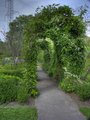
I like the juxtaposition of the pylon against the pretty archway. Sadly the sky is not working so well
Photographer found comment helpful.
Final Words
09/19/2009 03:48:42 AM
Final Words
by nicoleangel

Comment:
Hello Nicole

Greetings from the critique club.

I got the chance to critique this from the club archives, which is why it is coming so long after the challenge.

I think this was a good first entry in what I think was quite a difficult challenge. It's never easy to portray death photographically (at least that is my opinion).

As far as the image goes, I think your idea was a good one. I do believe you could have increased your score a little bit with some changes to your camera set up and some some small tweaks in post processing.

Looking at the settings on your camera, I think you were probably hand holding the camera for this image, right? If you had used a tripod (even if you don't have one, something solid to place the camera on could work almost as well) I think you could have increased your f number to something like f8 which would have increased the depth of field a bit. I know you would have needed to reduce the shutter speed, but if you were using a tripod this would be OK. I think ultimately it would have resulted in a sharper image, which is a big help on DPC. (Voters like things sharp typically).

A quick adjustment using a levels adjustment layer (assuming some sort of photoshop or other software is available to you) would have rendered the whites a bit whiter. As it stands, the whites have a greyish feel to them and this makes the image feel a bit flat and lacking contrast.

Overall I think this was a good first entry. Keep it up.

Feel free to pm me if you want further comment or clarification on anything.

Photographer found comment helpful.
Pearl Dawn
09/16/2009 11:41:00 AM
Pearl Dawn
by Ecce_Signum

Comment:
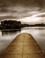
Not a shoehorned image from where I am standing
Photographer found comment helpful.
Pages:   ... [432] [433] [434] [435] [436] [437] [438] ... [658]
Showing 4341 - 4350 of ~6575


Home - Challenges - Community - League - Photos - Cameras - Lenses - Learn - Help - Terms of Use - Privacy - Top ^
DPChallenge, and website content and design, Copyright © 2001-2026 Challenging Technologies, LLC.
All digital photo copyrights belong to the photographers and may not be used without permission.
Current Server Time: 08/10/2026 03:34:23 PM EDT.