DPChallenge: A Digital Photography Contest You are not logged in. (log in or register
 
Browse Settings
Currently viewing:
Membersalmiakki

Show comments:

Per page:

Order:

Comments:


Comments Made by salmiakki
Pages:   ... ... [659]
Showing 261 - 270 of ~6584
Image Comment
George Washington could have used this
06/28/2015 04:29:53 PM
George Washington could have used this
by posthumous

Comment:
Greetings from the Critique Club

Been a very long time since I did one of these, so I maybe a bit rusty.

I'm quite shocked to see this only scored 5.6 - I think it's a solid entry and your B&W conversion is good. I like the high contrast look. I suppose the lack of detail in the shadows is what pushed the score down a bit. The voting is at least pretty consistent.

I would have expected this to be much closer to a 6 than it is.

Photographer found comment helpful.
Castlewood Canyon State Park bridge span
06/28/2015 04:24:29 PM
Castlewood Canyon State Park bridge span
by Mddoane

Comment:
Greetings from the Critique Club

I notice you have quite recently joined DPC and have entered only a few challenges. Hopefully you have not been put off by the scoring and will come back for more!

You were up against a lot of strong competition in the bridges challenge and you managed to pull off quite a reasonable score - just short of 6.00. However, I think this image could have done lot better with some small changes in the post processing.

The composition is strong, with nice leading lines and the rocks to the left add some nice foreground interest. However, to my eye it feels slightly over exposed in some places, which could most certainly have been adjusted in post processing. Additionally, I feel the Black and white conversion, whilst suiting this image needs a bit more "oomph". By that I mean strong contrast so the blacks are more black.

I would also recommend you clean your sensor! There are sensor dust spots very evident in the clouds. These will always show up more using a smaller aperture and using HDR software will always make them more visible. However, you can easily remove them in most photo software these days.

With those minor changes I do believe you could have pushed your score over 6
Linking the Old and New
06/28/2015 04:04:12 PM
Linking the Old and New
by dwyllie

Comment:
Greetings from the Critique Club

Beautifully exposed image and excellent processing.

I expect in Free Study this would have scored a higher as I think the bridge is perhaps not prominent enough. Difficult to capture that bridge however. I recall it to be rather a busy place

I don't have much to comment, as it is a very good image and anyway did well in this challenge.

Photographer found comment helpful.
Hot place
06/28/2015 03:56:43 PM
Hot place1st Place
by Gudjonotto

Comment:
Greetings from the Critique club

Very difficult to write a critique for the Blue in a free study!

This has the combination of good composition, excellent colours and a good subject. It's a little bit exotic for most of us, so plenty of wow factor for those who like this type of shot.

I can understand why it scored well and you landed the blue.
Fleas
06/28/2015 06:03:34 AM
Fleas
by Phocal

Comment:
Greetings from the Critique Club

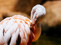
Some of the older images are popping up in the queue now and this is one of them.

This is a common subject here on DPC as a consequence I feel certain that it was compared to some of the other shots that have appeared before it. It's human nature to do that.

I confess I did only give this a 5. Why not a 6 or more?

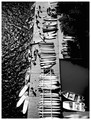
Composition: for me it feels awkward. It's clearly been cropped due to the odd aspect ratio (5 x 3.75?), I assume to remove something that was distracting on the left side. Lots of space to the right, but part of the body cropped off. I didn't find that to be pleasing. I wonder if you'd cropped it completely square if it would have been stronger? I think so. The partial body cropping wouldn't have disturbed so much and I don't know that negative space to the right adds much value. Sure it's pretty bokeh but....

Certainly the image is nice and sharp but the colours also affected my score given. I know it's probably due to the sunshine, but I felt the colour had a bit too much sepia/brown tone to it.

In a non-Free Study I may have given it a six (assuming it fit the challenge topic), but in a free study, I'm looking for something that peaks my interest and makes me look twice. Whilst a perfectly competent bird in a zoo picture, it was missing any wow factor.

It's good however, that there are a lot of different view points on DPC, buzzrock clearly liked it so take my critique with a pinch of whatever.

Sarah

Message edited by author 2015-06-28 06:25:08.
colorcarnival
06/26/2015 02:13:23 PM
colorcarnival
by colorcarnival

Comment:
Michelle, this is so pretty. well done!
Photographer found comment helpful.
mariuca
06/26/2015 02:11:31 PM
mariuca
by mariuca

Comment:
I would probably have guessed this to be yours. So very well spotted
Photographer found comment helpful.
herfotoman
06/26/2015 02:06:13 PM
herfotoman
by herfotoman

Comment:
what to say? No lions? Snakes? Elephants? This is a stunning image .
Photographer found comment helpful.
Melethia
06/26/2015 02:04:23 PM
Melethia
by Melethia

Comment:
I wish I had your eye Deb. You see things I walk right past. This has some gorgeous shadows
Photographer found comment helpful.
insteps
06/26/2015 02:02:46 PM
insteps
by insteps

Comment:
Henry, the point of view for this image is fantastic. Love the harsh contrast
Photographer found comment helpful.
Pages:   ... ... [659]
Showing 261 - 270 of ~6584


Home - Challenges - Community - League - Photos - Cameras - Lenses - Learn - Help - Terms of Use - Privacy - Top ^
DPChallenge, and website content and design, Copyright © 2001-2025 Challenging Technologies, LLC.
All digital photo copyrights belong to the photographers and may not be used without permission.
Current Server Time: 12/17/2025 12:39:31 AM EST.