| Image |
Comment |
| 02/07/2007 02:15:54 PM |
|
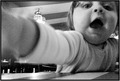
| 02/07/2007 12:58:00 AM |
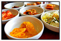
Simple Flowerby njb123Comment: Huh, I don't get that comment below. This is plenty shallow. I wonderful shot. Great colors. Fairly good composition. I think the focus point might be a little off. I might have preferred it on the center of the flower instead. Seems like it is on the lower stem and front edge of the petals. Still great shot. |
| 02/07/2007 12:13:04 AM |
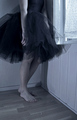
pas de deuxby silverfoxxComment: I like the perspective here... table love. Coloring/Mood is as excellent as always. Are you a ballerina too. Wonderful use of light as usual. I think the voters were physical expecting to see a table somewhere. Wonderful picture and style. |
 Photographer found comment helpful. Photographer found comment helpful. |
| 02/07/2007 12:10:32 AM |
By the ballsby quiet_observationComment: You beat me by 3 places, darn it. Na, congrats. A very simple photo that captures the spirit of the challenge nicely. Love the colors, the uniform blurred background, and the perfect symmetry of the balls...right down to the stripes! I had you pegged for a higher score than this. Great capture. |
| Photographer found comment helpful. |
| 02/06/2007 11:23:17 PM |
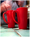
Mocha Javaby craigesterComment: Beautiful motion blur, great context and colors. I really like the persepctive. Using a wide angle here? A simple table shot that seems to have it all. Highly rated. |
| Photographer found comment helpful. |
| 02/06/2007 11:21:58 PM |
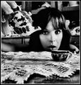
The Tea Partyby xXxscarletxXxComment: I love the B&W treatment here. I also love the perspective and the depth used. Nice textures and good use of the frame. Really there isn't much to complain about except one thing... While I like seeing DPC members in their shots, it just seems to get a little tiring sometimes. I do love when you break away from the self portraits like with your last entry. Not knocking down the score or anything. It is an excellent shot. Highly rated (actually my highest rated in the challenge). |
| Photographer found comment helpful. |
| 02/06/2007 11:16:59 PM |
What's this?by gwreckerComment: One of my favorites in the challenge. Love the angle, the perspective, and the context. Not sure if the "grain" was added after the fact, just maybe a bit too much noise/grain. I don't mind it, it is just a little excessive. Minor quibble to a great photo. Highly rated. |
| Photographer found comment helpful. |
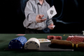
| 02/06/2007 10:32:28 PM |
Ace of Spadesby Elvis_LComment: A fairly typical shot here. I expected a few of the same type theme. It is well executed though. Maybe a bit too much black space, but maybe it was needed... At first glance I did not notice the smoke coming from the cigar. This is what really makes the picture. I might have liked the smoke to be a little more prevelant, hopefully others catch it as well. Maybe a bit more in the depth of field department might have helped??? Without the smoke, just an average picture, but with the whole cigar smoke thing going on highly rated. |
| Photographer found comment helpful. |
| 02/06/2007 10:28:46 PM |
after darkby junior_zComment: Fun negative effect going on. This is the type of shot that really puts this type of effect to good use. Almost a bit nerve racking, nice mood, and terffic colors. The format also works well, not sure of the gray border though. |
| Photographer found comment helpful. |
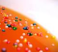
| 02/06/2007 10:18:22 PM |
Jellyby mahan92Comment: I like the colors and patterns going on here. Interesting abstract. Though I am not sure how it fits the challenge. Normally tables are flat, so i am not quite certain what I am seeing here. In a different challenge a high rating, here not so sure. |
| Photographer found comment helpful. |
Home -
Challenges -
Community -
League -
Photos -
Cameras -
Lenses -
Learn -
Help -
Terms of Use -
Privacy -
Top ^
DPChallenge, and website content and design, Copyright © 2001-2026 Challenging Technologies, LLC.
All digital photo copyrights belong to the photographers and may not be used without permission.
Current Server Time: 06/23/2026 10:07:59 AM EDT.