| Image |
Comment |
| 11/07/2004 08:25:19 PM |
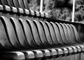
Take Your Seat.......by LisaCanComment: Critique Club
This definately does meet the challenge but for me it holds little interest beyond that. If you follow the lines you run into those very light posts at the end of the seats and that just distracts from the overal image.
The photo however, is in excellent focus and the lighting is very good...watch out for the distractions. |
| 11/07/2004 08:23:00 PM |
Kojo's Story of Hopeby TranquilComment: Critique Club
Excellent composition here good lighting and detail. Your problem as you have stated yourself is it is very weak in saying poverty. There just isn't enough here to know that it is a poverty stricken area or child.
I will though again say excellent composition...just stay closer to the theme of the challenge. |
 Photographer found comment helpful. Photographer found comment helpful. |
| 11/07/2004 08:20:14 PM |
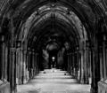
Lines of Perceptionby TranquilComment:
Nice photo with a gothic feel to it. I think you could have made a much stronger image by showing more artifacts of the structure There is only a small area of it that is well lit and it grabs my attention to look for more details in the columns. Message edited by HBunch - Removed Critique Club status. |
| Photographer found comment helpful. |
| 10/20/2004 10:39:13 PM |
CHILD EDUCATIONby chusterComment: I really like the way this one makes you think about the challenge. Nice work. 10 |
| 10/05/2004 07:53:27 AM |
Peace Pleaseby SonifoComment: Very nice I like how you have everything balanced out here. Well done 10. |
| Photographer found comment helpful. |
| 09/13/2004 09:44:29 AM |
|
| Photographer found comment helpful. |
| 09/13/2004 09:26:51 AM |
New hatby cabaComment: I like what you have going here. Very cute and grabs your attention. |
| Photographer found comment helpful. |
| 09/13/2004 09:23:46 AM |
Twice a day.by phoensoulComment: I like that tooth brush holder...to cute...also very nicely done. Good concept....8 |
| Photographer found comment helpful. |
| 09/13/2004 09:22:57 AM |
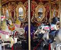
Opulenceby amsmythComment: that appears to be a beautiful merry-go-round...i'm just wondering why you shot it with that post in the middle of the photo and created something that looks like two images cause of it. In my opinion you would have a stronger photo with a horse in the center and if the support posts were still an issue allow them to frame the horse rather than cut the photo in half. |
| Photographer found comment helpful. |
| 09/08/2004 09:38:02 AM |
|
Home -
Challenges -
Community -
League -
Photos -
Cameras -
Lenses -
Learn -
Help -
Terms of Use -
Privacy -
Top ^
DPChallenge, and website content and design, Copyright © 2001-2026 Challenging Technologies, LLC.
All digital photo copyrights belong to the photographers and may not be used without permission.
Current Server Time: 05/31/2026 12:30:31 PM EDT.