| Image |
Comment |
| 06/25/2007 09:20:10 AM |
|
 Photographer found comment helpful. Photographer found comment helpful. |
| 06/25/2007 09:17:34 AM |
Art Attackby graphicfunkComment: Wow, cool photo. I like the inclusion of the glass, especially the piece at the top which seems to be flying out. Well done and well conceived. |
| Photographer found comment helpful. |
| 06/25/2007 09:15:31 AM |
The Anglerby LeeDComment: First time I've looked at the images in this challenge. This is a wonderful photo. Very sweet. Glad it made the top 50. |
| Photographer found comment helpful. |
| 06/25/2007 09:11:40 AM |
The Underbelly of The Whaleby hotpastaComment: Awesome image, truly. Sorry I didn't get a vote in this challenge as this would have scored high from me. Interesting that some voters were bothered by the underside/backside thing -- I wondered if that would happen. Congrats on your top ten. |
| Photographer found comment helpful. |
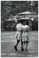
| 06/25/2007 09:06:11 AM |
The Shared Umbrella by MelethiaComment: Congratulations on your well-deserved ribbon. Tough choice between the color and b&w versions -- both are terrific photos. Cheers! |
| Photographer found comment helpful. |
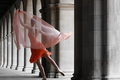
| 06/25/2007 09:04:40 AM |
Placid by lovethelightComment: I can't believe you accomplished this after reading your description -- the fact that it is a self-portrait amazes me. Congratulations on your well-deserved ribbon. I hope your camera recovers! |
| Photographer found comment helpful. |
| 06/25/2007 09:02:05 AM |
Often Unseen by MK153Comment: Todd, congratulations on your first ribbon -- and a blue!
I agree you chose the better photo, although your model has a beautiful face!
|
| Photographer found comment helpful. |
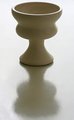
| 06/22/2007 12:10:41 PM |
Vase Day 20by riversongComment: Hey, Darlene. The image is not noticeably crooked to me. The vase is a classic shape and the symmetrical composition works well for that. Good lighting and interesting shadow. I might like to see a bit more space at the top, but overall it's a beautiful shot! |
| Photographer found comment helpful. |
| 06/22/2007 09:06:33 AM |
|
| Photographer found comment helpful. |
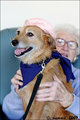
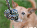
| 06/22/2007 08:54:00 AM |
21. 'The Rope'by suemackComment: Good composition on this -- it tells a story. It occurs to me that you've focussed our eye on the rope just as Bailey is focussed. |
| Photographer found comment helpful. |
Home -
Challenges -
Community -
League -
Photos -
Cameras -
Lenses -
Learn -
Help -
Terms of Use -
Privacy -
Top ^
DPChallenge, and website content and design, Copyright © 2001-2026 Challenging Technologies, LLC.
All digital photo copyrights belong to the photographers and may not be used without permission.
Current Server Time: 07/24/2026 01:08:12 PM EDT.