| Image |
Comment |
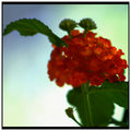
| 07/03/2007 11:51:04 AM |
Day 1 Sunburst Lantanaby TCGuruComment: Wow, gorgeous shot, and I like your story, too. I would have guessed that you had run some sort of filter on this to achieve these colors. Well done. |
 Photographer found comment helpful. Photographer found comment helpful. |
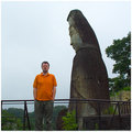
| 07/02/2007 12:46:58 AM |
01day3445by Pug-HComment: Cool, I like how the statue helps throw the focus back on you. Good exposure, too. |
| Photographer found comment helpful. |
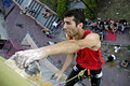
| 06/27/2007 02:15:47 PM |
Climbing...by gipomontesantoComment: Originally posted by gipomontesanto:
Thank you for ur comments and ur votes. I think this photo perfectly matches with the description: "...use the surrounding space of your subject to create the wow of the photograph..." |
Gipo, I did not see it this way when I voted, but you are right: according to the challenge description, your photo fits. Anyway, as I commented earlier I like your photo and I did not score it too low. :-)
|
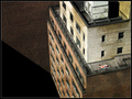
| 06/27/2007 09:59:39 AM |
Clean Linesby PixelKingComment: Congratulations, Jeff, on your 33rd place and on your 6.+ score. I'm glad you chose this photo over the other one. Great job. |
| Photographer found comment helpful. |
| 06/26/2007 09:19:26 AM |
Climbing...by gipomontesantoComment: This is a really good photo, though the use of negative space is questionable, as so much of the frame is full of detail. |
| Photographer found comment helpful. |
| 06/25/2007 10:51:55 AM |
The Sunbatherby muur88Comment: Hi, someone pointed this photo out in a recent forum thread -- I'm glad I got a chance to see it. It definitely says "New York" to me. An iconic photo. |
| Photographer found comment helpful. |
| 06/25/2007 09:42:14 AM |
The short stackby Shadowi6Comment: Originally posted by smardaz:
... the way he is holding his cards ruins it for me, maybe that is the intention of your shot i cant be sure |
??? Wow, no offense to the commenter, but how can people question your intention? "Oh, sorry, I didn't realize the cards were backwards?" Jeez.
Sorry this didn't go over, I thought it was very clever. |
| Photographer found comment helpful. |
| 06/25/2007 09:34:46 AM |
Lonely Joggingby OmniComment: Wow, from the thumbnail I thought this was a fish! LOL. I agree with the comments about the harsh lighting, though I like the contrast between the bright orange and the dark background. |
| 06/25/2007 09:31:08 AM |
Violin Intermezzoby pepitoidComment: Beautiful colors. Inspired by the famous Man Ray photo? Fits the theme perfectly and should have scored much higher. |
| Photographer found comment helpful. |
| 06/25/2007 09:25:54 AM |
Honest & Modestby TezComment: 5.58 -- not bad for a male nude on DPC, and safely in the top half of entries.
Someone wrote: "My first thought was ugghh" -- ???
Jeesh, everyone's a critic. :-) |
| Photographer found comment helpful. |
Home -
Challenges -
Community -
League -
Photos -
Cameras -
Lenses -
Learn -
Help -
Terms of Use -
Privacy -
Top ^
DPChallenge, and website content and design, Copyright © 2001-2026 Challenging Technologies, LLC.
All digital photo copyrights belong to the photographers and may not be used without permission.
Current Server Time: 07/25/2026 07:10:48 AM EDT.