| Image |
Comment |
| 03/23/2009 08:49:56 AM |
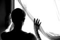
Out of the Night That Covers Meby CharleneComment: I love this serious, enigmatic photo. It got my only "9" vote (and I didn't give any 10s). The b&w works very well. Meets the theme in an understated but clear way. I like how it lets you decide for yourself for who or what she is hoping. |
 Photographer found comment helpful. Photographer found comment helpful. |
| 03/21/2009 12:42:30 PM |
|
| Photographer found comment helpful. |
| 03/21/2009 12:40:02 PM |
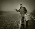
Come onnn!!!by nutzitoComment: This idea occurred to me, but I was too lazy (and too far from an open road) to go out and shoot it. Nicely done.
+ Bump up. |
| Photographer found comment helpful. |
| 03/21/2009 12:39:45 PM |
|
| Photographer found comment helpful. |
| 03/20/2009 04:27:29 PM |
Ken 1.jpgby judojoeComment: Another judo guy, or just a friend? Appealing photo, I like how you've posed and captured him, though the photo could use a little punch. Maybe more contrast, or maybe just tweak the sharpen a bit? |
| Photographer found comment helpful. |
| 03/20/2009 12:16:19 PM |
retouching22.jpgby trnqltyComment: Good job! Marking this as a favorite so I can come back and try and follow your steps someday. Thanks for your generosity. |
| Photographer found comment helpful. |
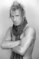
| 03/20/2009 12:12:38 PM |
Viking bloodby MephistoComment: Yeah, I loved this portrait. The only reason I gave it a 9 instead of a 10 was that I couldn't tell if I liked the photograph or the fact that the subject is just so darn sexy. :-D |
| Photographer found comment helpful. |
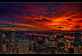
| 03/18/2009 02:04:07 PM |
Manhattan Lightsby NeilComment: Neil, for me this had several strikes against it. First, I felt inundated by sunsets in this challenge, so this suffered in comparison. Second, if my score is hovering between two numbers, and I see a letterbox frame, I'll probably go with the lower number, because I think a letterbox frame adds a quality that isn't inherent to the photo. (I realize that may be unfair, but it's my own personal pet peeve lately). Most important, though, as a result of processing I thought this ended up sort of "muddy." I agree with Ken that the print version looks more realistic and may I add sharper.
Originally posted by oldbimmercoupe:
call me a conspiracy nut, but I also detect an anti-NYC bias here. |
Oh yeah, there's that, too. I *know* that's why my entry bombed. ;-) |
| Photographer found comment helpful. |
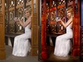
| 03/18/2009 12:17:47 PM |
Hidden smileby WalesPComment: I thought this was a self-portrait by Jutilda! Lighting is strong, but a "semi-candid snap?" Hardly. |
| Photographer found comment helpful. |
| 03/18/2009 12:04:34 PM |
|
| Photographer found comment helpful. |
Home -
Challenges -
Community -
League -
Photos -
Cameras -
Lenses -
Learn -
Help -
Terms of Use -
Privacy -
Top ^
DPChallenge, and website content and design, Copyright © 2001-2026 Challenging Technologies, LLC.
All digital photo copyrights belong to the photographers and may not be used without permission.
Current Server Time: 07/28/2026 11:18:02 AM EDT.