| Image |
Comment |
| 09/14/2007 08:24:09 PM |
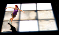
A Sport of Grace and Finesseby AtroposComment: Critique Club feedback -
I'mnot really qualified to critique graphical art, and to me this very much looks like graphical art. Were you going for a painted glass sort of look? I'm guessing yes in which case you nailed it. |
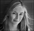
| 09/14/2007 08:21:58 PM |
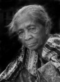
Window to the Soulby acoppolaComment: Critique Club feedback -
Nice portrait of an interesting face. One suggestion wouldbe a much tighter crop. This would make the most of those great facial details as well as lessen the need for burning out the background. A little background might even add to the image overall.
Nice work! |
 Photographer found comment helpful. Photographer found comment helpful. |
| 09/14/2007 08:20:36 PM |
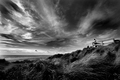
Glancing out to Seaby jblaylockraynerComment: Critique Club feedback -
Heh, why in the world you are requesting a critique I wonder. You have an eye for a scene, are creative and certainly a master of the technicals. This image is no exception to any of that, and the score it received reflects this as well.
My personal opinion - You did a really nice job dodging up some details in the foreground. For the sake of tonal balance, an equal amount of effort on some of the highlights in the clouds might work as well and keep the upper right portion of the shot from washing out a bit.
Great work (as usual) ! |
| Photographer found comment helpful. |
| 09/14/2007 08:17:31 PM |
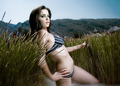
Sports Illustrated Swimsuit Editionby trnqltyComment: Critique Club feedback -
Nice lighting and the reflection under the model is a nice touch here. Her face looks a bit odd and as I see you were using hte liquify tool, I have to wonder if that's not the cause. A tighter crop might work well here as you are presenting this as a swimsuit model shot - let the model dominate the image. Overall, this is a good photo. |
| Photographer found comment helpful. |
| 09/14/2007 08:15:49 PM |
cuatrocienegasby gastonComment: Critique Club feedback -
This is a very interesting image in that the lighting almost makes it appear to be 'fake' as if the model is standing in front of a studio background. Assuming this is all real, lowering the flash output and/or allowing more of the ambient light into the scene might make for a better balance and more natural looking scene. It may also be worthwhile to bring the model out in front of the shrubbery, as partof the vegation is covering her body.
Good shot! |
| Photographer found comment helpful. |
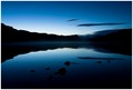
| 09/14/2007 08:12:45 PM |
The Twilight Zone by McFrikkiComment: Critique Club feedback -
This is a beautiful landscape study. The blue gradients are wonderfully framed by the dark areas and you really nailed the long exposure while keeping the image crisp.
It's possible that this would have scored better and 'popped' more by either splitting the image in hald and letting the natural symmetry define the shot or by moving the horizon line up or down to emphasize either the sky or the lake - both are equally beautiful.
Really well done! |
| Photographer found comment helpful. |
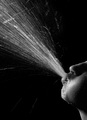
| 09/14/2007 08:10:06 PM |
Blow!by jstrongComment: Critique Club feedback -
Great shot! You really did a fine job with the lighting here and the composition works very well with the action. Given the editing rules, it may have been worth it to clone out some of the stray 'sprays' towards the bottom of the scene to keep the image cleaner, but that's a minor nitpick.
Well done! |
| Photographer found comment helpful. |
| 09/14/2007 08:08:11 PM |
Summerby alexjackComment: Critique Club feedback -
Lovely portrait, perfect b/w conversion. Your model/daughter is very pretty and flattered by both the lighting and the bit of wind carrying her hair. To that end, I would say this picture should be domainated by her and her alone. A closer crop to really highlight the face and hair might look even better.
Very nicely shot! |
| Photographer found comment helpful. |
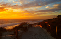
| 09/14/2007 08:06:15 PM |
To the Beachby robstComment: Critique Club feedback -
You can't hear it, but I'm cheering you and your victory over the temptation to process the sky into a grossly colored, unnatural scene. Beautiful colors and perfect exposure.
Avoid splitting the picture in half with the horizon. Pick what you want to emphasize (sky or ground) and place your horizon in the lower or upper third of the shot accordingly.
The light reflecting off the railings is a great touch. A bit more contrast might make this image feel more alive, though perhaps just applying it to the sky as the foreground is relatively dark as is.
Very nice! |
| Photographer found comment helpful. |
| 09/14/2007 08:03:27 PM |
Blue MZby danielvComment: Critique Club feedback -
Composition is great, lighting is good though perhaps a bit hot across the cheeks.
Things that could make this image even better -
* watch your color processing. There are artifacts showing up in the background from oversaturation.
* little easier on the sharpening or use the history brush to selectively back it out here and there. The left eyebrow in particular has a bit of a brittle look to it caused by sharpening artificats and halos.
I really do like that eye though - wonderful color and detail.
|
| Photographer found comment helpful. |
Home -
Challenges -
Community -
League -
Photos -
Cameras -
Lenses -
Learn -
Help -
Terms of Use -
Privacy -
Top ^
DPChallenge, and website content and design, Copyright © 2001-2026 Challenging Technologies, LLC.
All digital photo copyrights belong to the photographers and may not be used without permission.
Current Server Time: 06/23/2026 08:19:25 PM EDT.