| Image |
Comment |
| 09/22/2007 12:15:42 PM |
Stack wall textureby QuigleyComment: Man, I am damn glad to see you have put away the sewing machine because this is a really good study. Good eye for the shapes and textures, and the way you lined up that veritcal line was a good choice. Some might say 'where's the white point', but I think the range of tones is very nice here. |
 Photographer found comment helpful. Photographer found comment helpful. |
| 09/22/2007 12:13:18 PM |
IMG_2363.jpgby dainmcgowanComment: Great details on the building. Don't think the choice of tones enhances the shot. |
| Photographer found comment helpful. |
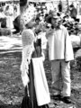
| 09/22/2007 12:12:34 PM |
wedding1.jpgby electrolostComment: Looks like some sort of hi-key, high contrast hybrid dunked in a tub of gaussian blur. I think that there is something in that combination worth pursuing as there are little glimpses of greatness dancing around in this shot, but in this particular shot I don't think you've hit the magic mixure quite yet. |
| Photographer found comment helpful. |
| 09/22/2007 12:10:53 PM |
And then... by dtremainComment: Very hard to lock the eye on the kids. Contrast is a bit muted, and there is a lot of really bright highlights in the background that keep pulling the eye. |
| 09/22/2007 12:09:22 PM |
White on blackby ATAPEComment: Shooting for stock now? This is good for such a basic sort of image. |
| Photographer found comment helpful. |
| 09/22/2007 12:08:44 PM |
|
| Photographer found comment helpful. |
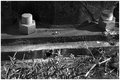
| 09/22/2007 12:08:08 PM |
Boltsby cogeroxComment: Interesting. Like lighting and the tones. Also like how the man made shapes contrast with the little bit of nature left behind. |
| Photographer found comment helpful. |
| 09/22/2007 12:06:16 PM |
|
| Photographer found comment helpful. |
| 09/22/2007 12:05:50 PM |
Day15.jpgby FotoMunkiComment: Interesting experiment. Don't care for it, but I applaud you for trying it out! |
| Photographer found comment helpful. |
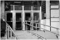
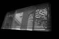
| 09/22/2007 12:04:51 PM |
Day16.jpgby FotoMunkiComment: I like this, even as 'boring' as it is - but I think if you cropped it so there was an equal amount of ngative space above the window and below it would feel much more balanced and and a lot of impact to the shot. My 2 cents. |
| Photographer found comment helpful. |
Home -
Challenges -
Community -
League -
Photos -
Cameras -
Lenses -
Learn -
Help -
Terms of Use -
Privacy -
Top ^
DPChallenge, and website content and design, Copyright © 2001-2026 Challenging Technologies, LLC.
All digital photo copyrights belong to the photographers and may not be used without permission.
Current Server Time: 06/23/2026 07:18:22 AM EDT.