| Image |
Comment |
| 07/31/2006 03:53:54 PM |
Appleby JRalstonComment: I like the bluish grays you've used here. While the shot is simplisitic, I don't actually feel it really nails the challenge. The apple is positioned in such a way that it appears to be tipped to the left which detracts from a sense of balance. Shot would benefit from some increased contrast. A different angle on the ledge might help here as well. This isn't a bad shot, but it just doesn't pull me in. 5. |
 Photographer found comment helpful. Photographer found comment helpful. |
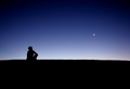
| 07/31/2006 03:53:49 PM |
all is calmby owenComment: Meets the challenge very well. In the sense that the bird is offset, the composition is well done. On the other hand, the shoreline does nothing but detract from the overall sense of serenity here. Cropped so that this is just the bird on the water with that wonderful reflection, I would have ranked this an 8. With the shoreline destroying my sense of calm and the washed out sky above just taking up space, I'm going to give a 5. Nice work. |
| Photographer found comment helpful. |
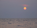
| 07/31/2006 03:53:26 PM |
soloby boysetsfireComment: Nice colors, nice composition. Very serene. With such a stark shot, you really cause any flaws to jump out. What takes away from this shot for me is the horizon line. It's rounded, that's ok. It's also tilted though and that tilt doesn't promote the sense of balance I'm looking for here. All in all, a nice shot. Bummer that moon wasn't bigger. 5. |
| Photographer found comment helpful. |
| 07/31/2006 02:51:52 PM |
Coasting Freeby TransitComment: This is a nice idea, poorly executed. On its own, before the LSD inspired post processing there is a composition here which really nails the challenge - sereneity, harmony, etc. Then the sky is saturated wayyyy too much flaring up those deep reds. Red is anything but a calming color. Add to it that the massive red sky somehow manages to defy physics and not reflect in all of the water it is covering and the sense of realism is shattered beyond repair. The horizon is tilted which always detracts. The reflection of the canoe is cropped off which is also disappointing. Less of the red sky, less red in the sky, turn up those nice blues in the calm water and this shot would have fared much better. 4. |
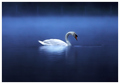
| 07/31/2006 02:47:52 PM |
Serenity by AlexSaberiComment: Meets the challenge in every regard certainly. So over processed as to appear to be a painting rather than a photograph. That said, and precisely for that reason, this shot will probably rank very high, but for me the computer enhanced imagery actually detracts from the sense of harmony and serenity. I also think the composition would have benefited greatly by moving the bird off center. Nice shot overall. 6. |
| Photographer found comment helpful. |
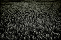
| 07/31/2006 02:38:13 PM |
Wheatby bucketComment: I like this shot a lot, but I don't like it in this challenge. Colors (or lack of) are great, but the wheat (I assume it is wheat) is so noisy as to make for a very chaotic image in a challenge that asks for serenity and harmony. A shallower dof might have helped a bit with this by knocking out some of the details as the image recedes into the background. The dark areas at the top left of the image and to a lesser extent the top right detract from the continuity of the image. Like I said, I like this shot but it's just not meeting the challenge descs as well as I would hope. 4. |
| Photographer found comment helpful. |
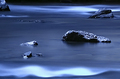
| 07/31/2006 02:35:35 PM |
My quiet placeby KelliComment: There is serene and there is boring. This shot tends more towards the boring, I'm sorry to say. The lack of contrast throughout the picture and the predominance of that dull gray is what creates this effect. The waves on the water don't contribute to a serne feeling for me. Overall I think this might have been a nice idea but needs work to better meet the challenge. 4. |
| Photographer found comment helpful. |
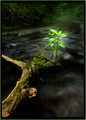
| 07/31/2006 02:33:43 PM |
|
| Photographer found comment helpful. |
| 07/31/2006 02:33:33 PM |
Seeking its Ownby dahkotaComment: Like the colors and the placement of the rocks make for an interesting composition, if a little centered. Seems to suffer from some focus issues as nothing appears sharp. Perhaps this was your intent. It does meet the challenge scope well as it is is very serne and gives a good sense of harmony within nature. Shifting everything to the left would benefit the way the eye is drawn through the shot and, in my opinion, getting at least one thing in sharp focus would actually add to the sense of dreaminess as everything else would seem to fade away. Nice work. 5. |
| Photographer found comment helpful. |
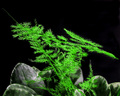
| 07/31/2006 02:27:32 PM |
Zen-Likeby ChinabunComment: Composition is too centered. Would like a shallower DOF to blur out the rocks a bit. Green is too saturated for my taste. It is a simple setting but does not give me a sense of harmony, balance, serenity. The jaggedness of the fern and its dominance of the frame are what detract from these things for me. 4. |
| Photographer found comment helpful. |
Home -
Challenges -
Community -
League -
Photos -
Cameras -
Lenses -
Learn -
Help -
Terms of Use -
Privacy -
Top ^
DPChallenge, and website content and design, Copyright © 2001-2026 Challenging Technologies, LLC.
All digital photo copyrights belong to the photographers and may not be used without permission.
Current Server Time: 06/21/2026 02:59:17 PM EDT.