| Image |
Comment |
| 07/31/2006 04:17:15 PM |
Silent Sentinelsby MelethiaComment: I like the dreamy effect here. Very serene, good balance between sky and earth. Meets the challenge well. Trees should be in sharp focus, doing so would not destroy the effect. I would also move them to the right and crop out that little scraggly one. Horizon is a bit sloped. Overall, a nice shot. 5. |
 Photographer found comment helpful. Photographer found comment helpful. |
| 07/31/2006 04:16:31 PM |
B R E A T H Eby -Bec-Comment: Composition is good. Nice color on the background void. Overall, it just doesn't grab me. I'm sorry I can't give some technical insight as to why, but it just doesn't do it for me. Possibly some better lighting on the cloth that would give some better contrast and bring out those wrinkles and folds. Not sure. |
| Photographer found comment helpful. |
| 07/31/2006 04:16:27 PM |
Zen Photographyby MayaMComment: Very, very busy photo. Looks to be a bit oversharpened and there is simply too much for they eye to focus on. Shallower DOF maybe, cutting off right behind that little ornament. Overall it's just too busy (and a bit too dark) to promote the sense of serentiy, balance and harmony that is the goal of the challenge. 4. |
| Photographer found comment helpful. |
| 07/31/2006 04:14:53 PM |
...and I, I took the one less traveled byby jerseyjimComment: This shot had some potential and suffers from a few things. Unfortunately in 'simple' shots, any flaw stands out that much more. First, I'd suggest taking this shot on your knees. The persepective of the road would be flattened out a bit and add much more to the sense of a path off into infinity. I like the light coming through the trees quite a bit and I like the white surface of the road. All very serene and do well by the challenge. Composition is well balanced. Don't care for the amount of darkness on the left side of the shot. Suppose you can't control nature's lighting, but if the fade to black was a bit more gradual and those trees jus a bit more defined as they came towards me on the left it would have worked better. Overall, nice work. 5. |
| Photographer found comment helpful. |
| 07/31/2006 04:12:30 PM |
Concertby ImagineerComment: Nice shot and probably no easy feat to capture it. Would like the flower to be sharper. As it stands with the bee so razor sharp, it appears to be hovering a good distance more towards the viewer than the flower it is apparently trying to get to. The whole image begs for increased contrast as well. This image does give a sense of harmony, though at the same time it does not give me a sense of serenity. Nice bokeh, and I think the grayscale works well. Nice job, 5. |
| Photographer found comment helpful. |
| 07/31/2006 04:12:25 PM |
Harmonyby IvoryComment: Nice shot. I think the wire is a bit too sharp and sort of wrecks the overall serene, dreamy effect here. Blur the wire a bit (maybe just focus at the background) or, better, remove it entirely and I'd have ranked this a bit higher. 5. |
| Photographer found comment helpful. |
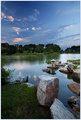
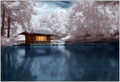
| 07/31/2006 04:11:05 PM |
Japanese Tea House by elsapoComment: The IR effect is not very serene. It excites my mind's eye, it does not calm it. The composition here is perfect, the still water is great, the lighting and the trees - everything for a truly harmonious, serene shot exists in this photograph, but the IR trades it all in for eye candy glitz and really sends everything south. Do I like this photo? Yeah, a lot. Do I like it in this challenge? No. 5. |
| Photographer found comment helpful. |
| 07/31/2006 04:02:35 PM |
Green Wonderby levyj413Comment: Nice abstract, nice minimalist shot, nice color on color. Nice zen? It's not doing it for me. I don't get any sense of balance or harmony (one color dominates, balance destroyed by the only object being in the bottom corner) and the frog is a bit freaky looking for me to get a sense of serenity from this. I get what you were going for here, I just don't think you nailed it. Outside of the challenge, I think this is a fine photo. 4. |
| Photographer found comment helpful. |
| 07/31/2006 04:00:20 PM |
One quiet day in july.......by ivargComment: Ripples on the water, even as slight as they are, make a mess of that reflection which lends a sense of business to the shot. The little blob of black to the left where the water meets the shore also distracts. Overall this is a nice shot, but it doesn't give me a sense of harmony, balance, serenity, etc. I think the big chunk of green shore on the right goes a long way towards ruining the effect. Overall a nice photo. 4. |
| Photographer found comment helpful. |
| 07/31/2006 03:56:25 PM |
What Do You See?by JPRComment: This is an interesting photo and one that would have done better (by me) in a different challenge. Those black dots on the surface of the metal object could have been lined up if shot from a different angle. I don't think the bird makes or breaks the shot so if it was lost in the process, no big deal. Red is not really a calming color, but here I don't think it is too bad. The shapes are pleasing and the internal shape created by the intersection of the objects is nice. Line the dots up and you acheived balance. Harmony? Serenity? I'm not sensing that here. Like I said, a really nice photo but something that might have found a better home in a different challenge. 5. |
| Photographer found comment helpful. |
Home -
Challenges -
Community -
League -
Photos -
Cameras -
Lenses -
Learn -
Help -
Terms of Use -
Privacy -
Top ^
DPChallenge, and website content and design, Copyright © 2001-2026 Challenging Technologies, LLC.
All digital photo copyrights belong to the photographers and may not be used without permission.
Current Server Time: 06/21/2026 01:32:00 PM EDT.