| Image |
Comment |
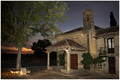
| 09/03/2006 12:29:16 PM |
Hermitageby lsmartComment: Nice flash work (if that's what it is), looks pretty natural. Subject is obviously the house, and then your title reinforces that. But it wasn't your fault the challenge idea was so lame, so it doesn't get held against you. Colors are nice but overall the photo is flat. Might have shot it from a different angle or taken a strong hand with curves to greatly increase the overall contrast. Lot of nice textures on that old house that could be brought out that way. Nice job. |
 Photographer found comment helpful. Photographer found comment helpful. |
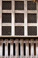
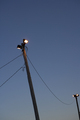
| 09/03/2006 12:27:03 PM |
Wood 'n' wireby WobbleComment: When presenting geometric shapes, you make it very easy for the eye to find things that are off balance, not level, etc. They jump out because everything else is so ordered. here the shot suffers from the wood frame along the top not presenting a straight line on any side. The subject itself I think is a nice choice - an interesting juxtaposition of shapes. I think some contrast boost might work here to make some of the textures in the wood jump out a bit more. The shot is a bit flat as is. Nice overall, you've got a good eye. |
| Photographer found comment helpful. |
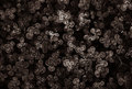
| 09/03/2006 12:24:42 PM |
Trianglesby aznymComment: Not sure why you would caption this 'triangles' and then submit it as a supposedly subjectless photo. Still, I'm not holding this challenge idea against anyone. The subject matter is interesting here and I like how you've presented it in black and white. I think a slightly stronger touch on the contrast would have benefited this by adding a little more pop and keeping the photo from washing out some. As is it borders a bit on being a mass of middle tones. I like to see black blacks, white whites, and everything in between. Overall this is a great entry, good luck. |
| Photographer found comment helpful. |
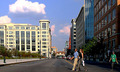
| 09/03/2006 12:22:38 PM |
Downtownby modurnComment: The composition here is quite nice actually. I think this challenge sucks in that every photo has a subject, and this one does as well, but I'm just ignoring the subjectless nonsense and voting on the photos for what they are. Processing - it is way, WAY too sharp. You need to back off the amount of sharpness or use a much smaller radius setting (or both). I like the colors being presented here. I think some extra work with curves to acheive a slightly stronger contrast between elements might also work well. Overall this is a very nice photo, it's just the PP that needs some extra attention. Very nice. |
| Photographer found comment helpful. |
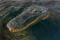
| 09/01/2006 06:32:03 PM |
DSC_0632v1GatorWide.jpgby yakatmeComment: wow, first thing I did was look at what lense and thought for sure it would be a telephoto. Nope! Very brave. What a cool shot. |
| Photographer found comment helpful. |
| 09/01/2006 09:28:06 AM |
Blue Eyes, Henna Handsby dsa157Comment: Lol, the girl at the Bristol Rennaisance Fair. I took pictures of her as well, and also the other guy and girl working the Henna booth.
Nice shot, good luck in the challenge. |
| Photographer found comment helpful. |
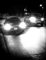
| 08/31/2006 12:19:38 PM |
***by agenkinComment: This is great except for the one headlight out of the 4 being so much smaller. Like the angle though, and what a great range of tones. |
| Photographer found comment helpful. |
| 08/30/2006 06:32:32 PM |
light.by rethsComment: Man this was a GREAT movie, you nailed this scene perfectly. |
| 08/30/2006 06:32:04 PM |
Un Chien Andalou - Luis Bunuel and Salvador Dali, 1929by xianartComment: Nice picture but if you're entering a challenge where one of the components in voting would be identifying the scene from a movie, why choose a movie that so few people will have ever heard of much less watched? Guess I'll take your word (or photo) for it. |
| Photographer found comment helpful. |
| 08/30/2006 06:30:55 PM |
|
| Photographer found comment helpful. |
Home -
Challenges -
Community -
League -
Photos -
Cameras -
Lenses -
Learn -
Help -
Terms of Use -
Privacy -
Top ^
DPChallenge, and website content and design, Copyright © 2001-2026 Challenging Technologies, LLC.
All digital photo copyrights belong to the photographers and may not be used without permission.
Current Server Time: 06/22/2026 05:03:14 AM EDT.