| Image |
Comment |
| 10/18/2006 09:14:03 PM |
Fearlessby DefyTimeComment: I like this shot. What keeps it from really getting me excited is the weird perspective problems. Left side of the door frame is off kilter, top is off kilter, right side is vertically correct. So basically, the smallest section of the background is the one that is nicely lined up. Might have worked better if the left side where your subject is was straight up. Believe this is a function of the angle you held your camera at and the distance you were from the door given the focl length of your lense. but whatever, I'll leave the physics to someone who knows. It just bothers my eyes. Other than that, the lighting itself is nice and well captured. Good job. |
| 10/16/2006 06:46:26 PM |
trying to hideby annahComment: I'm sticking with my initial reaction - best shot in the challenge. Nice finish, but hell of a picture. Kudos again. |
 Photographer found comment helpful. Photographer found comment helpful. |
| 10/15/2006 10:27:45 AM |
|
| Photographer found comment helpful. |
| 10/15/2006 10:25:31 AM |
|
| Photographer found comment helpful. |
| 10/15/2006 10:22:34 AM |
|
| Photographer found comment helpful. |
| 10/15/2006 10:21:36 AM |
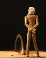
The Photographerby thegrandwazooComment: White balance is your friend. If you intentionally went for the yellow look, I have to say it really doesn't work for me. Other than that, cool shot. |
| Photographer found comment helpful. |
| 10/15/2006 12:49:11 AM |
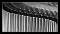
Rythmby buzzrockComment: This is great. Excellent subject choice for BW treatment with a nice mix of tones. The curve and tones combine to produce a gradient effect which is pleasing to the eye. Also the curve obviously juxtaposes against the abundance of straight lines in the image (not sure what other commentor was getting at there) which is a nice twist (no pun intended). Only thing that detracts from this shot (besides it being an abstract which is pretty much instant death on this site) is that the cases aren't standing perfectly vertically. some are slightly tilted and it detracts from the inherent geometric beauty in the image. Really cool, nice work. |
| Photographer found comment helpful. |
| 10/11/2006 11:13:45 PM |
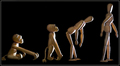
Past Will Followby gclarkComment: Most original shot I've seen. Do I like it? .... I'm really not sure. But the fact that it has stayed on my screen for more than 2 seconds weighs heavily in your favor. |
| Photographer found comment helpful. |
| 10/11/2006 11:11:44 PM |
|
| Photographer found comment helpful. |
| 10/09/2006 08:31:02 PM |
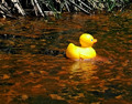
Emptyby Trumpeteer4Comment: One wonders if the facr of a person constitutes a major element. Neat looking shot though. Good luck. |
| Photographer found comment helpful. |
Home -
Challenges -
Community -
League -
Photos -
Cameras -
Lenses -
Learn -
Help -
Terms of Use -
Privacy -
Top ^
DPChallenge, and website content and design, Copyright © 2001-2026 Challenging Technologies, LLC.
All digital photo copyrights belong to the photographers and may not be used without permission.
Current Server Time: 06/22/2026 10:42:20 PM EDT.